

Sian Thompson
That's Not Very Ladylike
A dictionary about the words we love to hate.
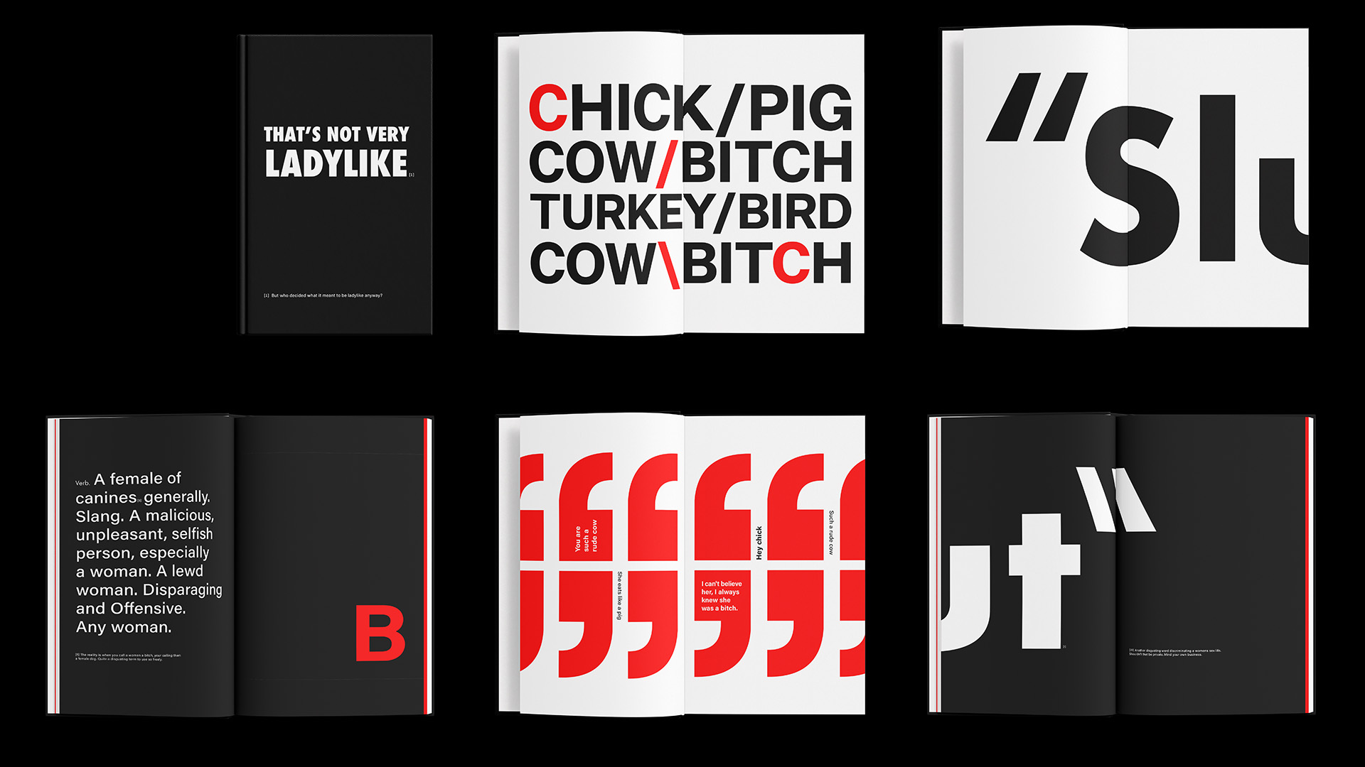
That's not very Ladylike is a typographic dictionary that uses typography to create a new way of seeing for words
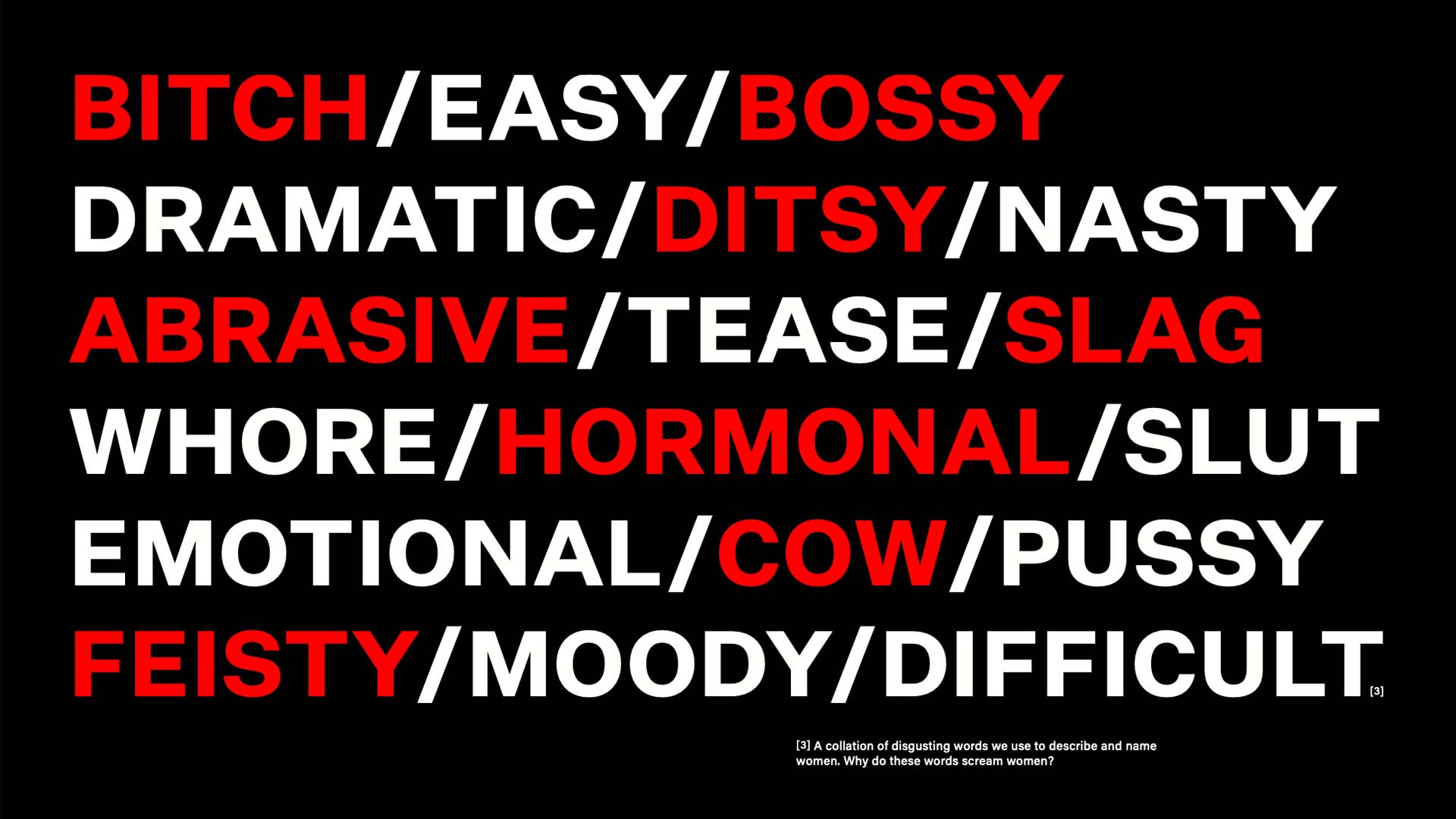
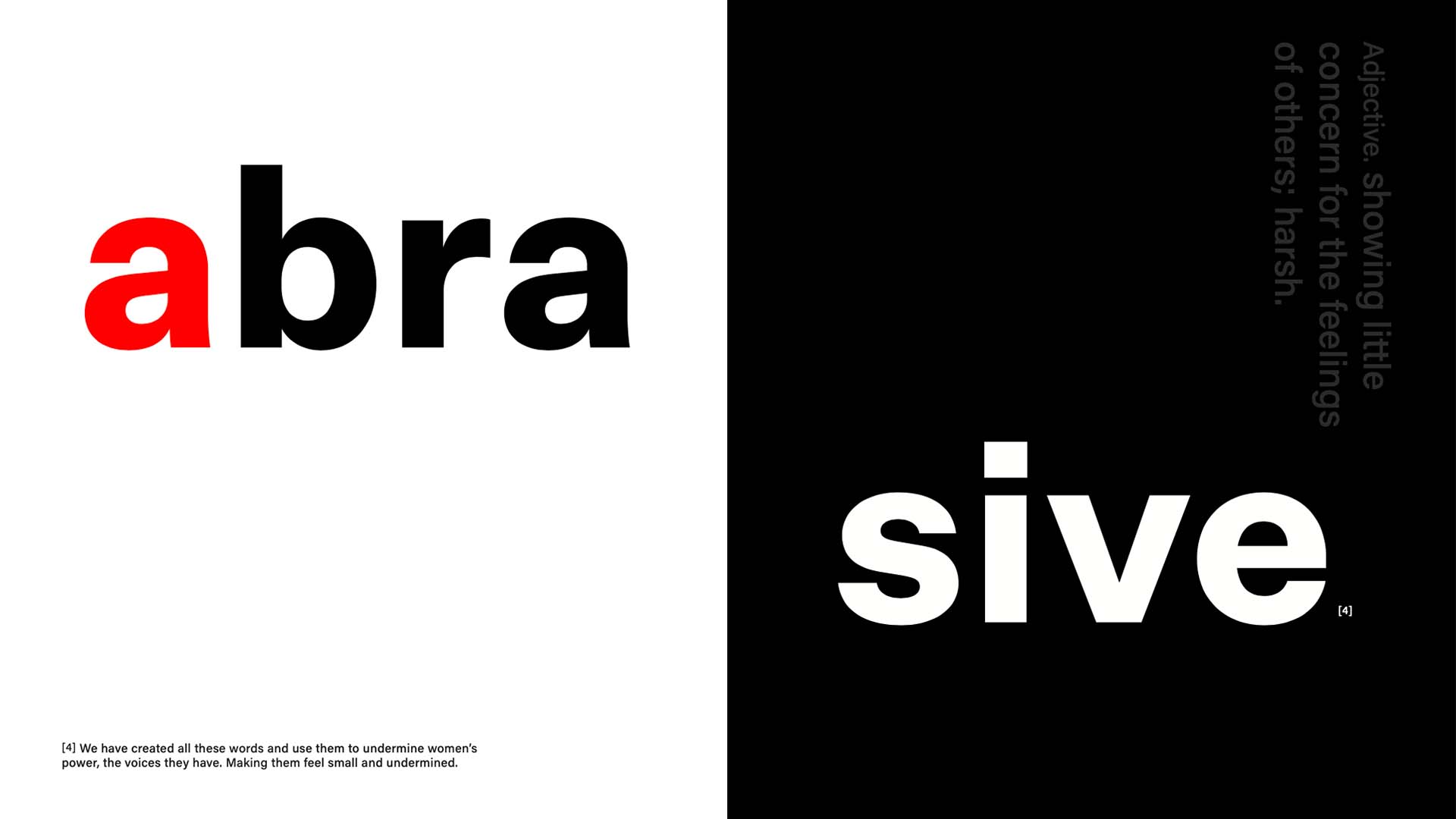
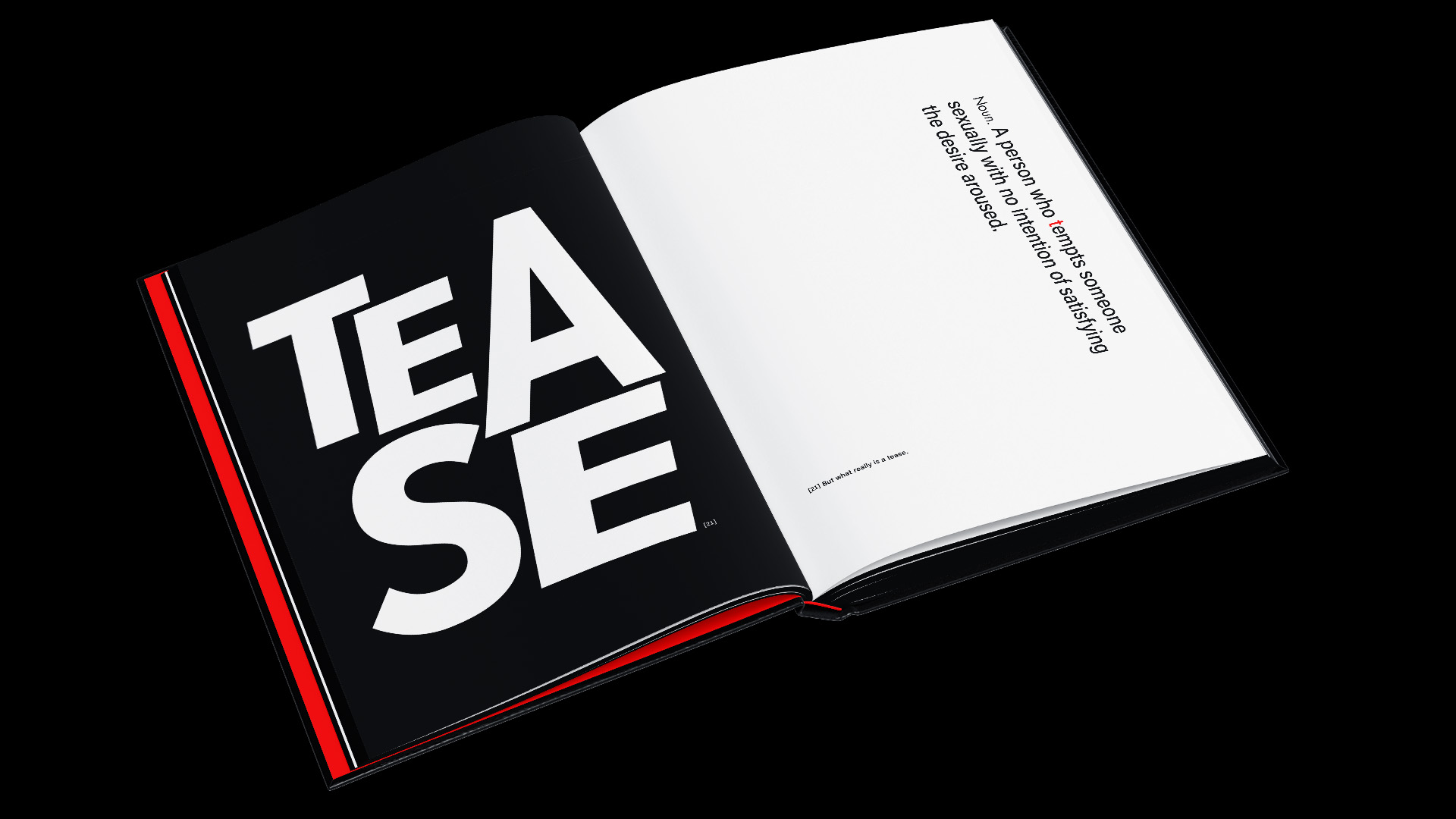
That's not very Ladylike is a typographic dictionary that uses typography to create a new way of seeing for words that negatively describe and name women. The world we live in has many inequalities between men and women, and the focus of this inequality is the discrimination of the words we use against women. We as a society have created a gendered vocabulary, and it's time that we are more aware of the words that we use, so we can understand the strong meaning of using them, and hopefully, it will create the audience to remove the use of these words.
As a designer, I can use my skills and processes to inspire social change and do social good for my society, and this project is a development of that. Creating a 70 page hard-covered publication with high-quality printing explores different words and their meanings in an alphabetical formula. The project uses a three-voice formula that uncovers the author's voice as footnotes, general quotes of the words in a social context, and finally, the words themselves.