


Designing for Multicultural Identities
Auckland is a melting pot full of diverse ethnicities, cultures, and languages. Amongst the diversity, there are people with multicultural identities, especially those of 1.5- or second-generation immigrants. A common phenomenon for anyone with a multicultural identity is to have come across an identity crisis. Their complex and peculiar identities affect their manaakitanga and whanaungatanga, leaving them to question their identities as tauiwi in our contemporary society. ‘Where We Belong’ is a design project that aims to provide a platform where people with multicultural identities can share their anecdotes and relate, and introduce to others some experiences people with multicultural identities may go through. This project discusses how a community may obtain its personalised voice and identity through communication design, especially through the use of typography. It also unpacks the idea of multicultural identity and its influence on an individual’s manaakitanga and whanaungatanga.
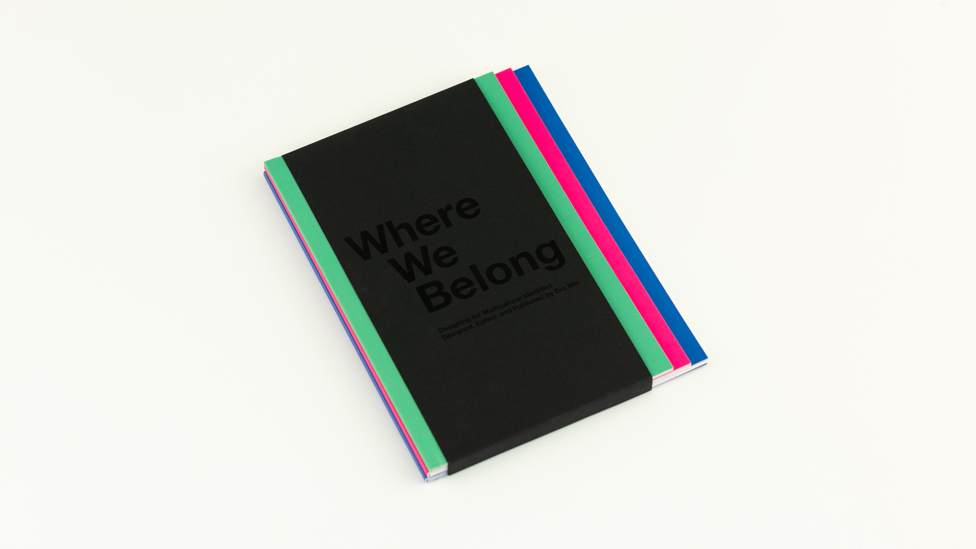
Coming from a multicultural and multilingual background, I underwent an identity crisis questioning where I belonged and who I was. Over the years, I have learnt how to appreciate and take advantage of my unique characteristics and accept my identity as it is. Thus, it prompted me to carry this project out to help people in the same shoes as me to figure out their identity through visual language. Design outputs include a publication consisting of a collection of interviews, photographic research, a display typeface, and a type specimen.
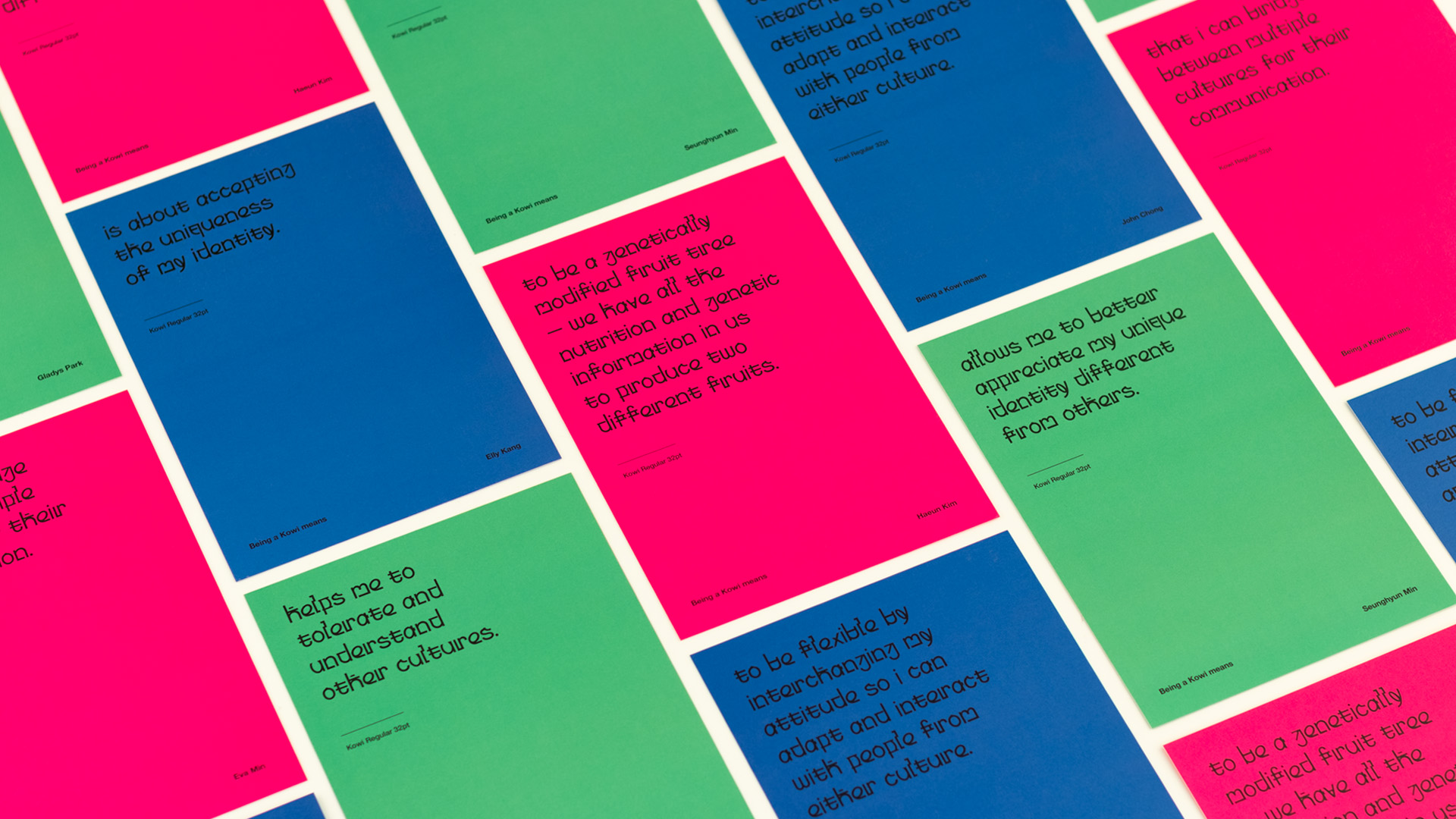
As a part of the project, I have created a multilingual typeface that hopes to help the Korean Kiwi (Kowi) community better celebrate and appreciate their unique identities. The Kowi typeface challenges integrating both Korean and English language, based on my influences as a tauiwi of Korean descent, to reflect the multilingual characteristic of a multicultural identity. I am using a unique language pattern called Konglish, commonly and comfortably used amongst Kowis, as a tool to visualise both English and Korean within a single typeface. The typeface integrates Hangul with English alphabets by replacing elements of alphabet letterforms with Hangul consonants that share the same pronunciation. The Kowi typeface strives to be a celebration and a representation of the Korean Kiwi language and be freely and appropriately utilised by the Kowi community as part of their identity.
In order to support the typeface design, I have conducted photographic research on Korean typefaces used in our contemporary New Zealand society. The photographic research surveys different Korean locations around Auckland, capturing the signs of the venues — the abstract visual representations of each location that makes their venues distinctive from the others.
Alongside the research, the project also includes a collection of interviews with young Korean Kiwi adults to amplify their voices as a community of a minor ethnic group and emerge both positive and negative everyday experiences people with multicultural identities may undergo in a melting pot like Auckland. The interview mainly questions their sense of belonging within the Korean Kiwi community and anecdotes around their identity crisis.
Through this project, I hope the Korean Kiwis and anyone with multicultural identities can empathise and resonate within the stories of others. I hope my design output in response to this conversation gets utilised as a tool to celebrate and clarify one’s identity.