Ben Forster
Typography of Little Queen Street

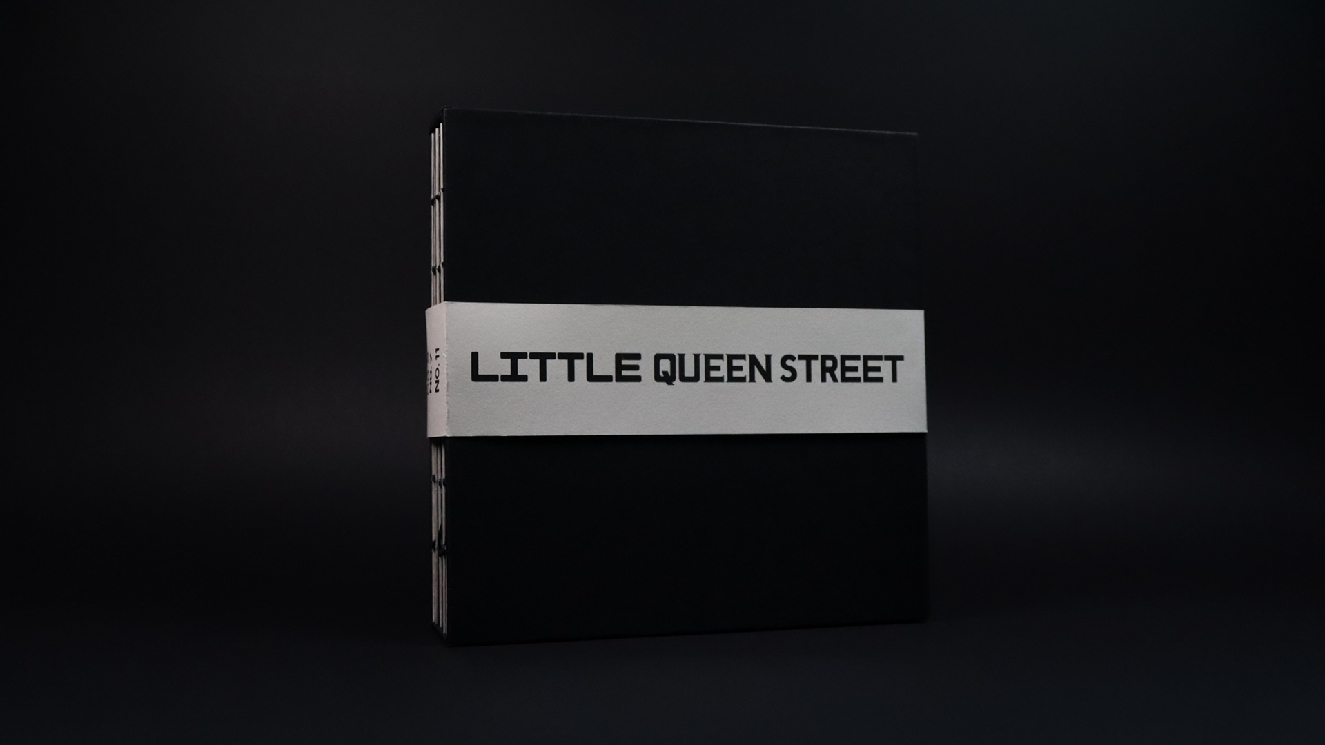
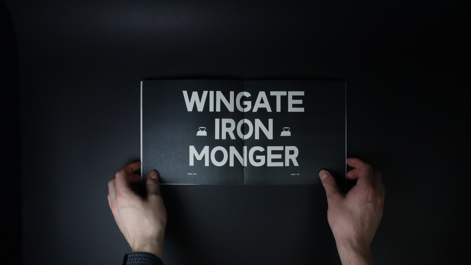
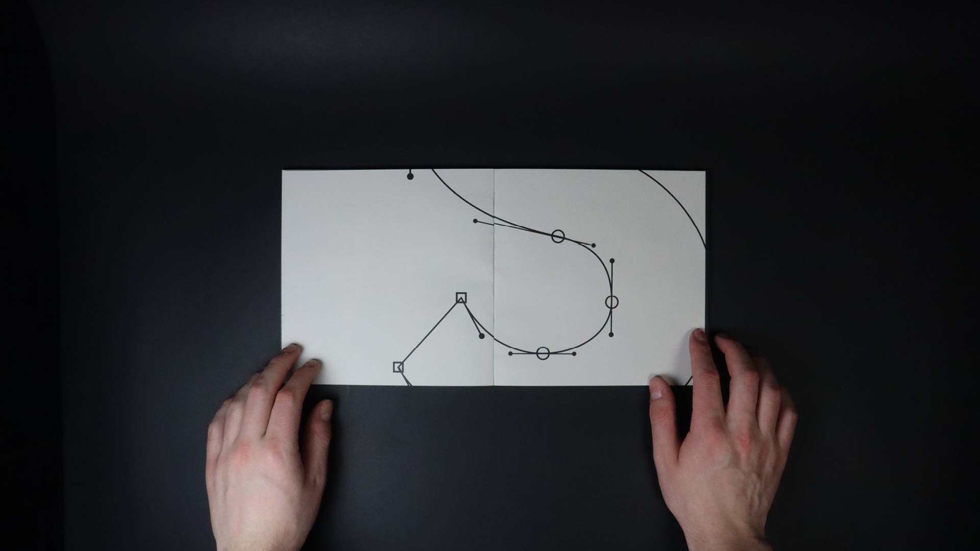
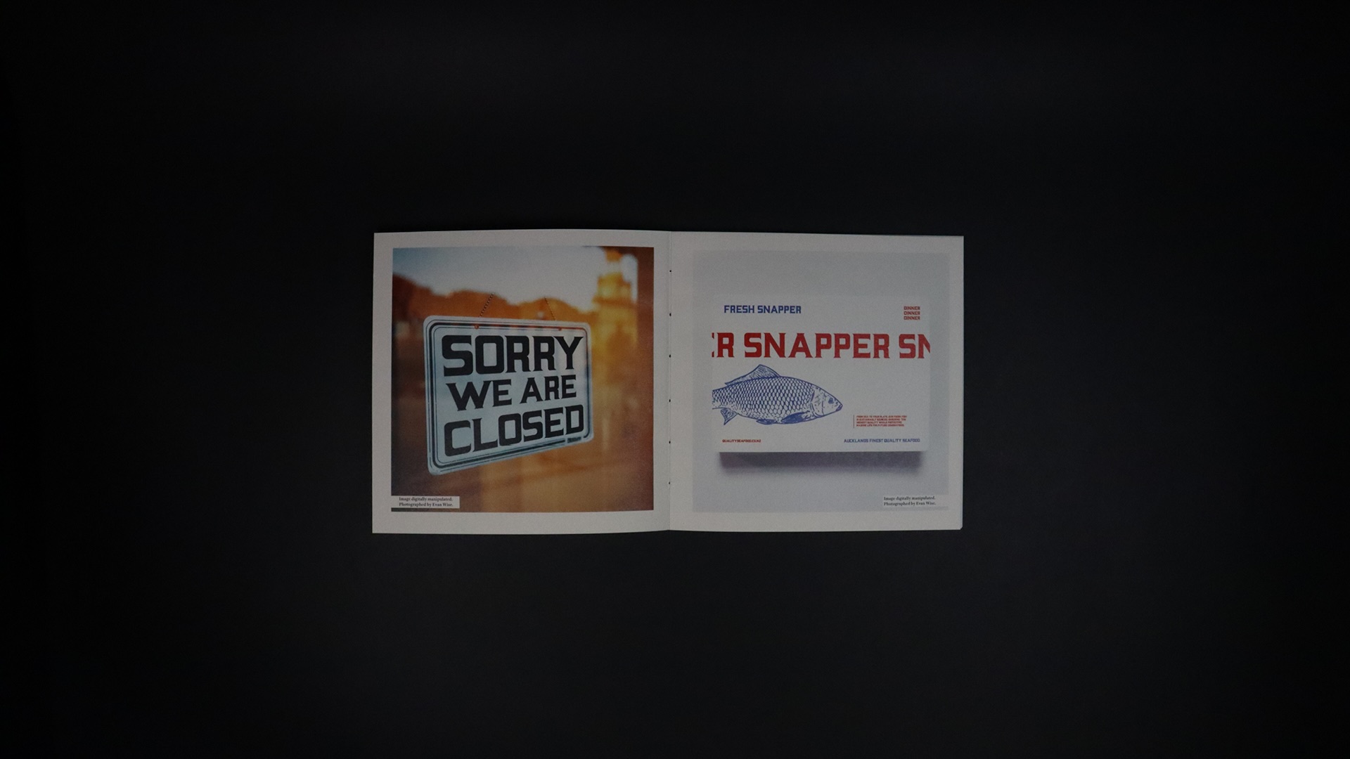
Derived from the archival imagery of Aucklands downtown this project looks into preserving Aucklands typographic history. Exploring the balance of historical typography and modern design, it focuses on the industrial architectural typography of Little Queen Street - a street once thriving with industrial activity in the 1900’s. Addressing the theme of heritage conservation, the artefact is a series of type specimen booklets that reveal the lost visual identity of Sanford, Wingate, and George Dodge Brothers through typography.
Exploring the typography of Little Queen Street, my project captures its history focusing on heritage preservation and encouraging the connection of modern design with historical identity.
I chose a design approach that merges historical preservation with modern design. Each publication is bound in black covers with debossed addresses of each business, echoing its industrial past, while aged pages and bold black type reflect its nostalgia and urban grit. The choice of Coptic binding showcases craftsmanship and enhances the book’s tactile quality, aligning with the handmade typography echoed though this series.


