


A Typographic Exploration of ADHD
I am a multi-disciplinary designer with a passion for creativity. I have a unique design output, with a creative and bold use of colour, typography, and manipulation of image. I enjoy bending the rules and finding the balance between design and art, with much of my inspiration being drawn from the Pop-Art movement and artists such as Andy Warhol.
Chaotic: A Typographic Exploration of ADHD is an auto-ethnographic enquiry exploring design as art through visualising my ADHD. I am investigating self-expression using communication design methods such as typography, colour, print, and animation. The main deliverable of this project is a designed typeface which is informed by expressive movement and self-exploration.
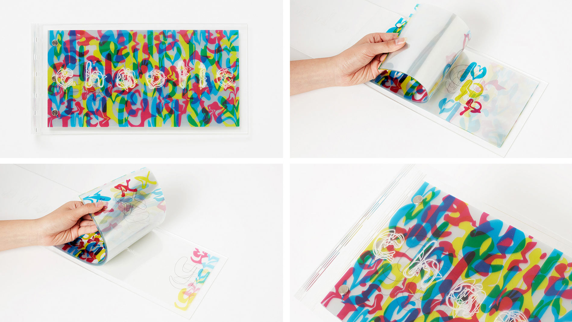
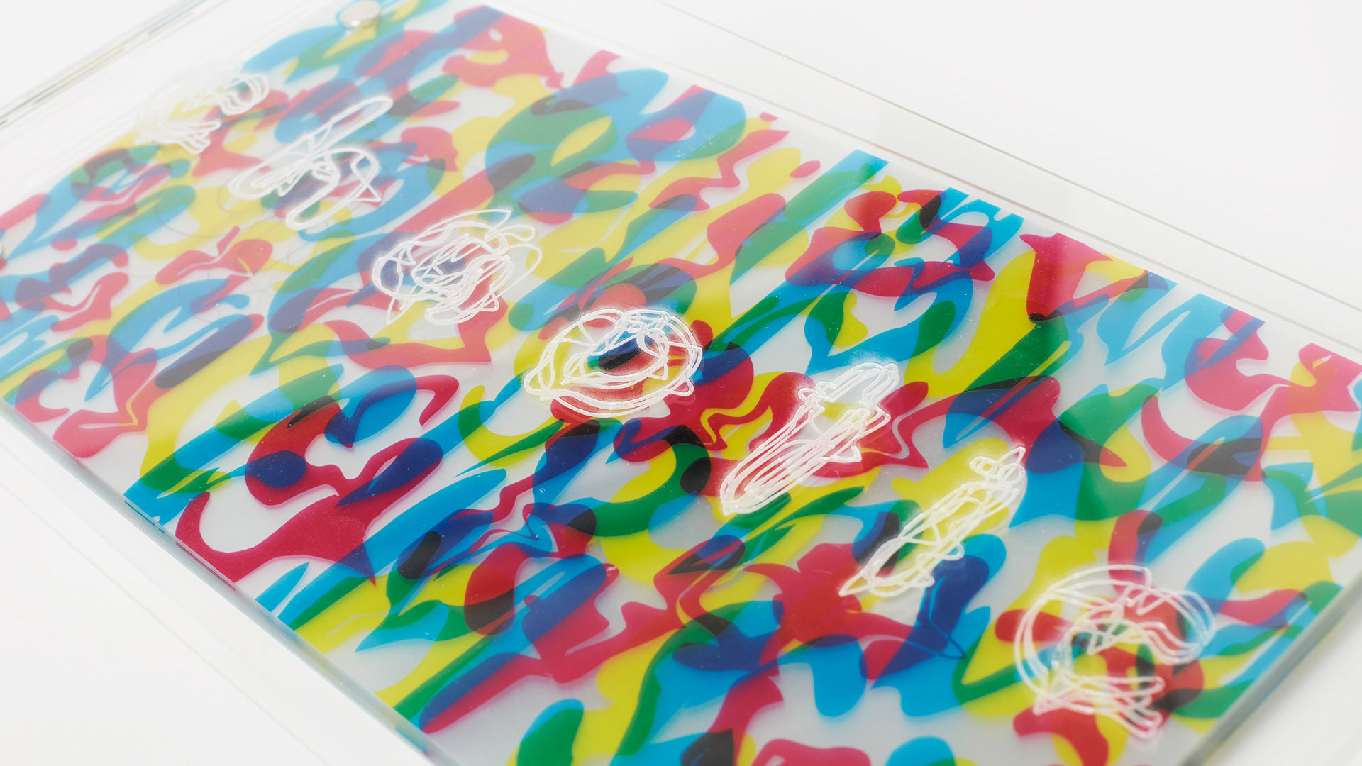

My brief is an exploration of expressive typography and design as art which has explored communication design methods including typography, print, colour, and animation to display a typeface that has been created with the intention of visualising ADHD through type. I have designed a typeface called ‘Chaotic’, which is presented in five variations: Regular, Inattentive, Impulsive, Combined and Random. I displayed ‘Chaotic’ in a kinetic type specimen animation video, a layered transparency publication, and a gloss poster.
The main idea behind the Chaotic project is to explore ADHD as a visual, physical experience as opposed to something understood only in the mind. I wanted to take something that only a percentage of people can experience and open that that to the masses, giving an insight into how my brain works. The work is informed by my personal experiences, thoughts and feelings, as well as a desire to explore and develop my personal practice and style.
The Chaotic typeface represents a visual expression of feelings through movement and colour, and communication without using words. This is important in terms of the context of the project, with ADHD being something experienced internally and projected externally. The well-known saying goes: “a picture speaks a thousand words”, which for me helps to build the framework for visually expressing the feelings felt as a person with ADHD.
I see typography first and foremost as form as opposed to something readable. This was brought into the work by turning the typeface into an expression rather than readable words. This was achieved by splitting the variations into three categories, named: Inattentive, Impulsive, and Combined - the three different types of ADHD. Doing this provided a clear vision of how different each of these types are, while also showing how they are interconnected within each other.
The way this was explored was by warping the variations of the typeface to express how each of these types of ADHD present themselves for me. With ‘Chaotic Inattentive’, the text was manipulated in a wobbling, rippling way to represent the “floating” away from something you’re meant to be concentrating on. ‘Chaotic Impulsive’ has one sharper warp going through a part of the letter which represents the sudden intrusion of thoughts, feelings and actions. Finally, ‘Chaotic Combined’ is made using ‘Inattentive’ as a base with the same warp technique as ‘Impulsive’ running through it. This reinforces that this type of ADHD really is a combination of the two other types.
Growing up, and even now to a degree, I have been embarrassed and ashamed by the fact that I have ADHD and I know I shouldn’t have to feel that way. The expectations that are set by society, university, work, etc. don’t consider a brain that isn’t “normal”. I struggle in a lot of ways that people don’t ever see because I have been trying to mask my ADHD and my “abnormal” brain for my whole life. Over the past couple of years, after making some significant changes in my life, I have begun to discover who I really am and how my brain actually functions. This is all incredibly personal to me, but I feel as if it is important to mention as it really does help frame my project and indicate just how important this project is on my journey of self-discovery.