


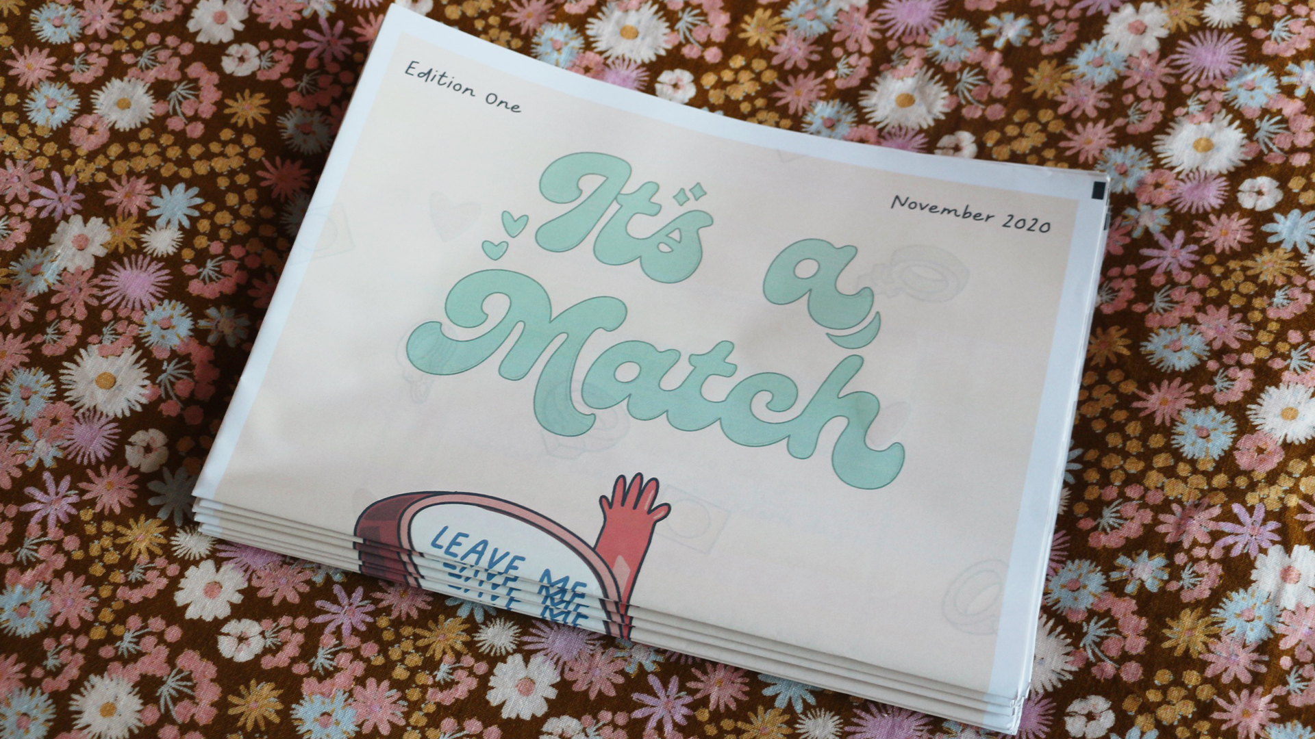
IT'S A MATCH!
Kia ora, I'm Ella, a Graphic Designer based on the Hibiscus Coast, just north of Auckland City. Currently, I am a young creative, refining my skills in Graphic Design, Illustration and Photography. I love to experiment and am always looking for a new way to make a design a little funkier.
I’m driven by my love for helping people, specifically the most vulnerable. I am passionate about solving world issues with innovative human-centred design & design thinking. I have a huge interest in working with ethical and sustainable brands and businesses that have a focus on improving rather than consuming.
Thanks for stopping by and taking a peek at my work!

Online dating has become a social norm over the past decade, and with the introduction of dating apps, it’s easier than ever to find a partner without leaving your house.
Teenagers and young adults in 2020 have embraced this new way of interaction and have taken it upon themselves to use these apps for a whole variety of reasons. A large majority of users have reported that they do not use these applications seriously, they use them as a way to interact, have fun, and play a game.
‘It’s a Match’ aims to help its reader navigate the current modern dating scene. Investigating how young adults interact with dating apps and the purpose and intent behind using them. It provides advice to the reader on how they can find success on a dating app.
It’s a Match is a content-driven Newspaper publication. Initially set to be a guidebook for online dating, it took on a new form and purpose after further consideration. Its submitted content informed the overall design and layout of the piece, so it’s only fitting that as the content was submitted the publication took evolved with the content. In its final form, I chose to juxtapose a traditional form of media with the Newspaper and a current-day form with online dating. The outcome was greatly influenced by the ’70s, vintage love columns and nostalgia. The artworks of John Alcorn, and Type designers Ronné Bonder and Tom Carnase inspired and informed a vast majority of my aesthetic direction and choices.
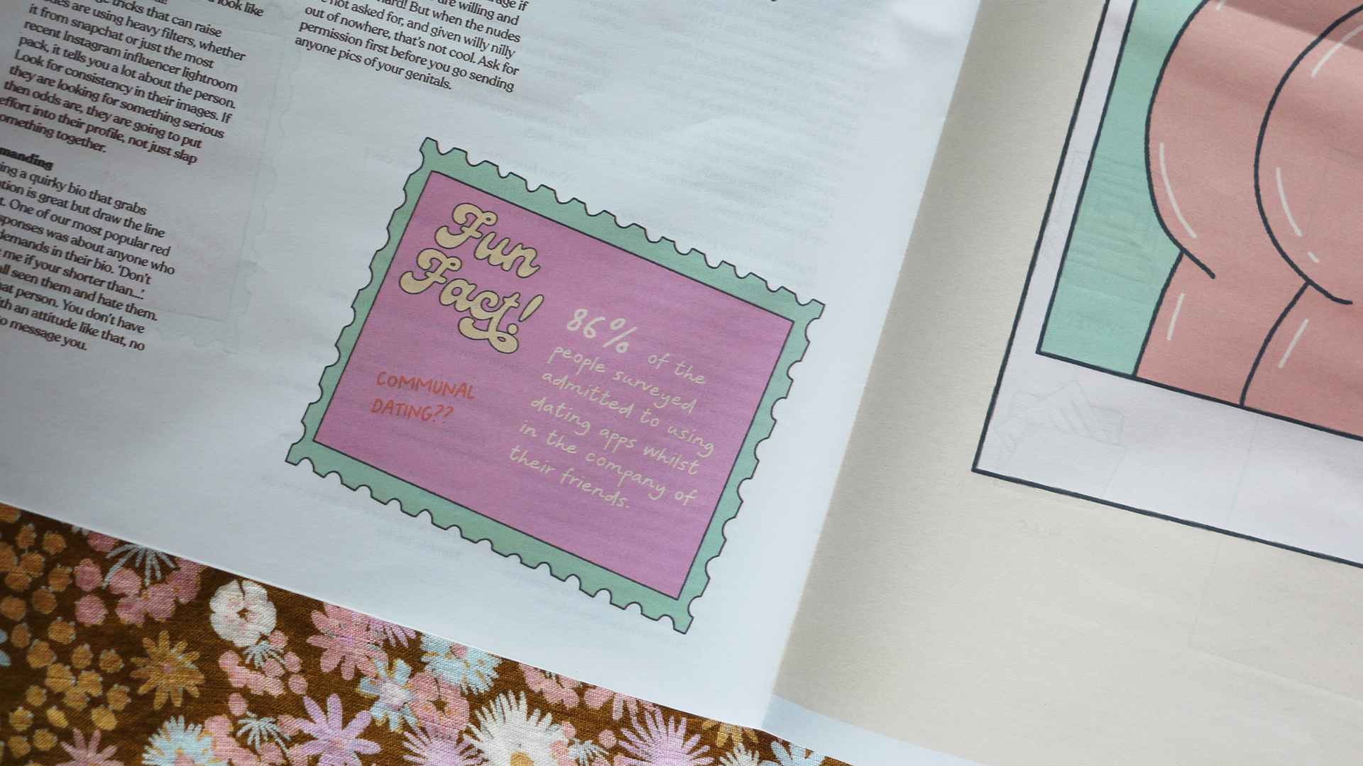
My process began with putting out a survey asking for anonymous answers, advice and stories about young adults’ experiences with online dating. The responses were phenomenal, with over 130 people taking part, the content was vast, unique and diverse. It became clear that although the subject matter was light-hearted, there was a deeper undertone to it. Trends started to arise in the data, and I used this to inform opinion pieces. Creating illustrations from the responses came easy. I took subjects, themes and topics into consideration. The appearance of the newspaper was informed by the data. I chose to steer away from the traditional layout of a newspaper, instead, I pulled elements like a coupons page, game section and text rows and kept the remainder of the page layouts less structured.
The outcome, a 16-page newspaper filled to the brim with advice, facts and fun imagery.