


A project about important animals in Vietnamese culture and architecture.
I love drawing. At three, I drew countless colourful shapes on the walls, and my father always had a bucket of white paint on hand to cover my doodles. My professional art and design journey started from my foundation in fine arts back home in Vietnam. Coming to AUT, I have learnt new aspects of graphic design: grid, typography, how to make design elements function effectively and serve certain purposes. Using metaphors and hidden meanings is important to my design practice. I believe layers of meanings add depth to the design and help the work to live on in people’s minds.
I always aim to use my strength in illustration for design projects. That is how “Linh Thú — Sacred Animals” was born: an integration of colourful shapes and typography. The postcards and website have both traditional and contemporary aesthetic values, which work together to communicate my Vietnamese root to outsiders.

Vietnamese began arriving in New Zealand during the 1970–80s. With around ten-thousand individuals (excluding international workers and students), our local Vietnamese community is only a small, and therefore would benefit from better design to communicate their existence and culture to outsiders. With cultural understanding as a key factor informing the project, I aim to communicate the beauty of traditional Vietnamese decoration on cultural buildings and their meaningful stories.
The importance of animals in Vietnamese culture is also a field of research. Animal decorations reveal the relationship between humans and imaginary or real-life animals. Worshipped at many temples, these animals are not pets or tools; they are respected and have a significant position in the culture.
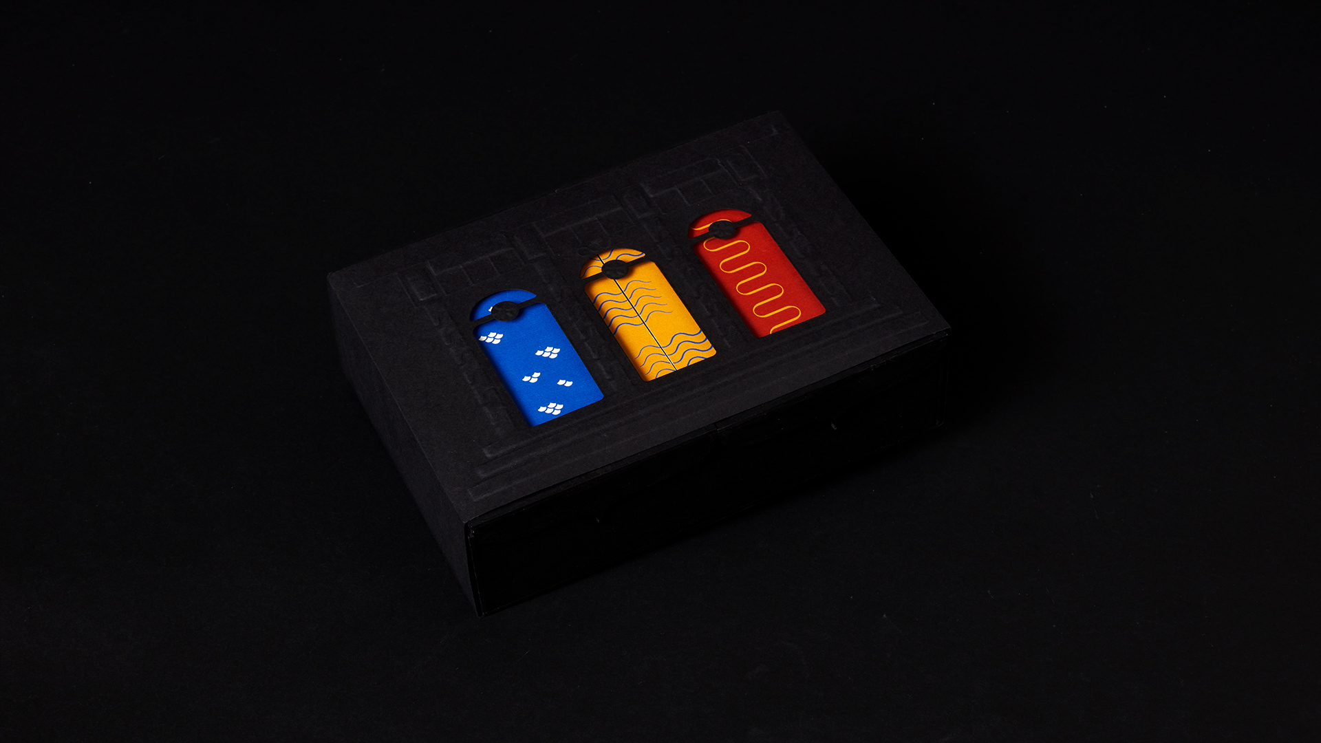
The last field of research is cultural/historical concern around fading traditions and dying cultures in modern times. In Vietnam, contemporary buildings are gradually replacing traditional ones and fewer people understand the sophisticated cultural aspects reflected in the buildings. This concern leads to the format of the project, which is the postcard. Postcards and traditional Vietnamese architecture have a close relationship as they are both traditional art forms that are fading away.
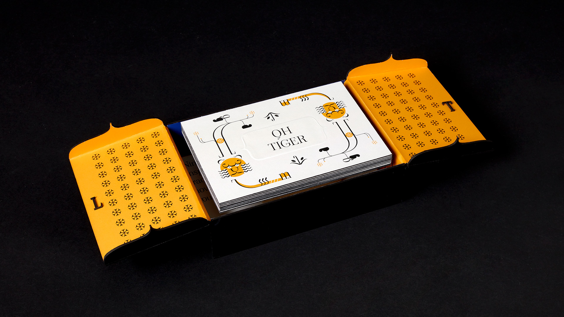
The postcards are for travellers or immigrants who keep in touch with their families via hand-writing letters and postcards. Vietnamese can gain insights into the beauty of our own culture, while the outsiders will be introduced and educated about it. The premium postcards are made for people who love highly-designed objects. The website is an accessible way for buyers to read more about animal illustrations on the postcards.
Formats, materials and techniques are important aspects of this project with many underlying meanings. The packaging is a rectangular box with two doors, which resembles a temple entrance, attracting the audience to discover the contents inside. The sleeve is a simplified version of a temple gate, with three cut-out holes that show the colours and animal patterns underneath. Both the box and the sleeve are matte black to create a sharp contrast with the colour. The use of embossing depicts the three-dimensional look and feel of architectural decorations. Textured paper on the postcards and packaging can bring a more premium feel to the product. The black packaging is coated with a black acrylic coating to prevent smudges and fingerprints.
Check out the website viet-sacredanimals.com for background stories of nine sacred animals.