


Emily Lewis
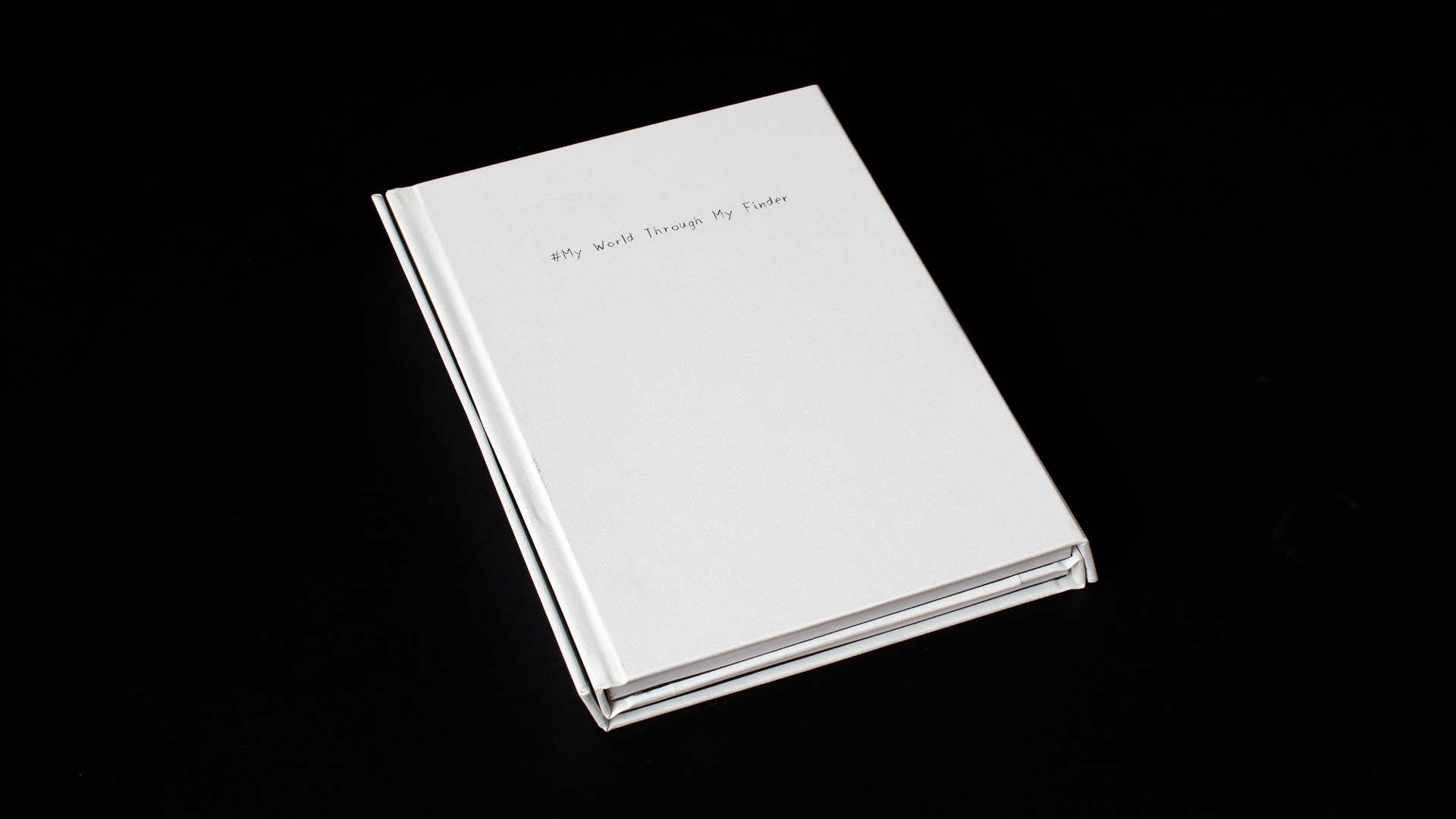
#My World Through My Finder
https://www.linkedin.com/in/cheezecakemonstr/
In the world we live in, we have so many issues associated with discrimination. As one mixed-race individual, I decided I wanted to create a publication that points out racism towards mixed-race specifically. Many people imagine, “Black” or “Asians” not much of mixed raced people. As a half-caste, as a designer, I wanted to create something that I can communicate my thoughts on stereotypes and racism. I achieved to create a publication which expresses myself as a half-caste and a designer. My publication contains short stories about my experiences as a half-caste. Good stories and bad stories. To show my diversity, I created the book in two languages, Japanese and English with a unique binding method.
‘# My World Through My Viewfinder’ is a multi-lingual publication containing my short stories as a half-caste. I contained a Japanese version and English version in one book to portray my identity as a half-caste - to state that I am both Japanese and New Zealander.
This book is targeted towards two different types of people with different purposes. First, targeting all people who have never thought about how mixed races feel. It is targeted towards the younger generation just because it is more of a topic we should be thinking about growing up to make a peaceful world. The second is all the mixed races. I want them to know that they are not the only ones feeling what they are feeling, and there are people who can relate.
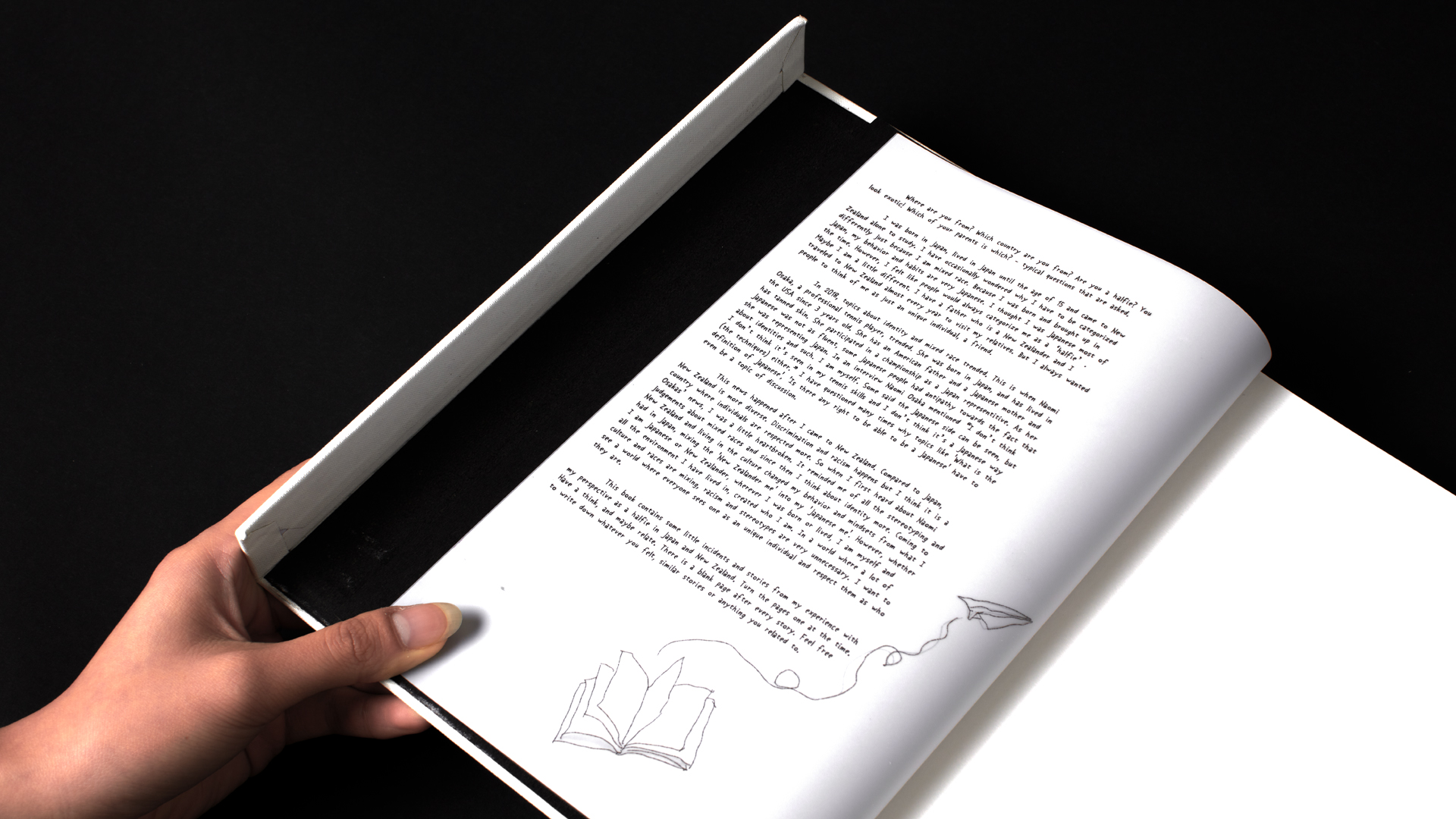
The book title ‘# My World Through My Finder” is originally an Instagram hashtag. It is mainly used for photography. Users tend to use it to express their photography skills or to express a precious moment. I have always liked this hashtag, and when I thought about it, I realized the photos that are posted on Instagram is actually “My World Through My Lens”. Images need to go through the lens to create a physical image. I am assuming the finder is used because it sounds better. However, I am using this hashtag for a story. Something that happened to me is my story. And until it’s told, no one knows. Same as the image you see through the finder. Until you press the shutter button it is a view you only see. So in my books’ context, I chose this with a message ‘I have some stories that some may not understand, but I am here to share to you’, exactly what people do on Instagram.
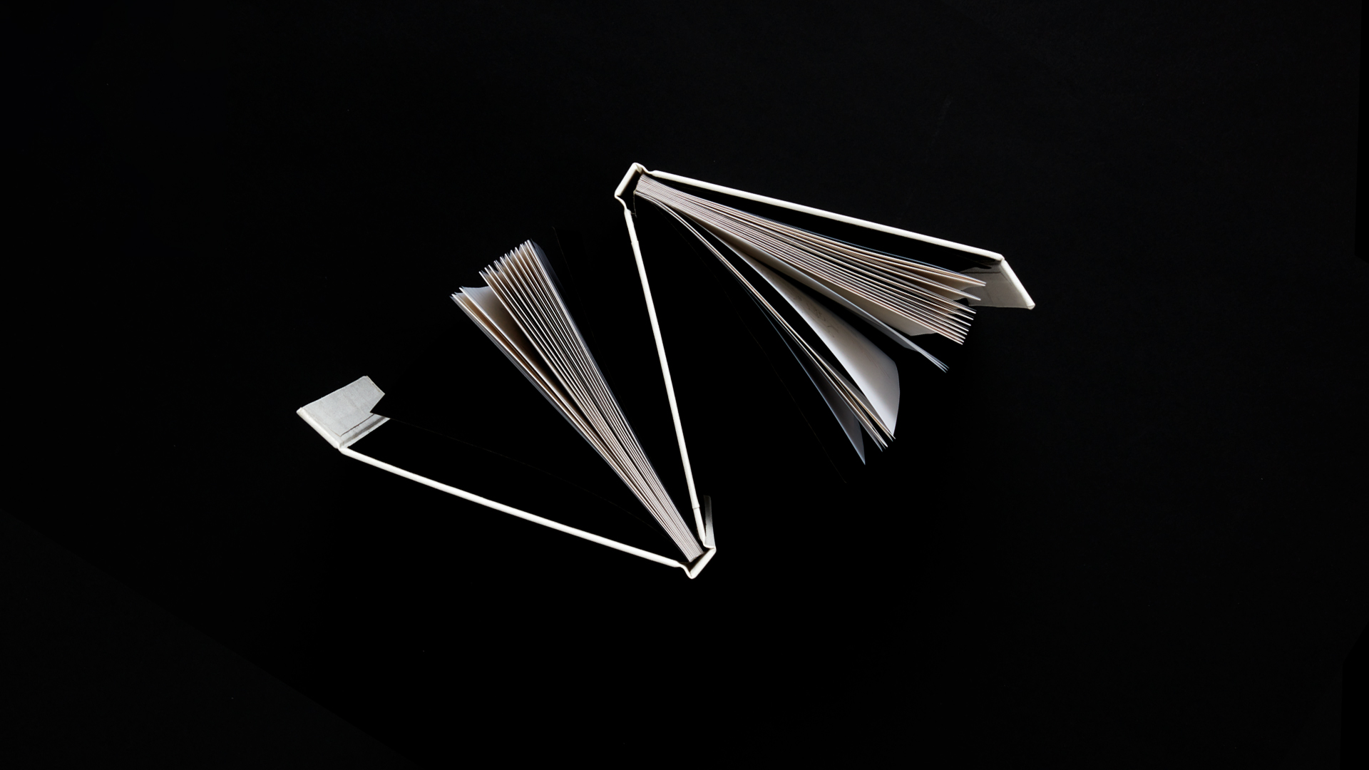
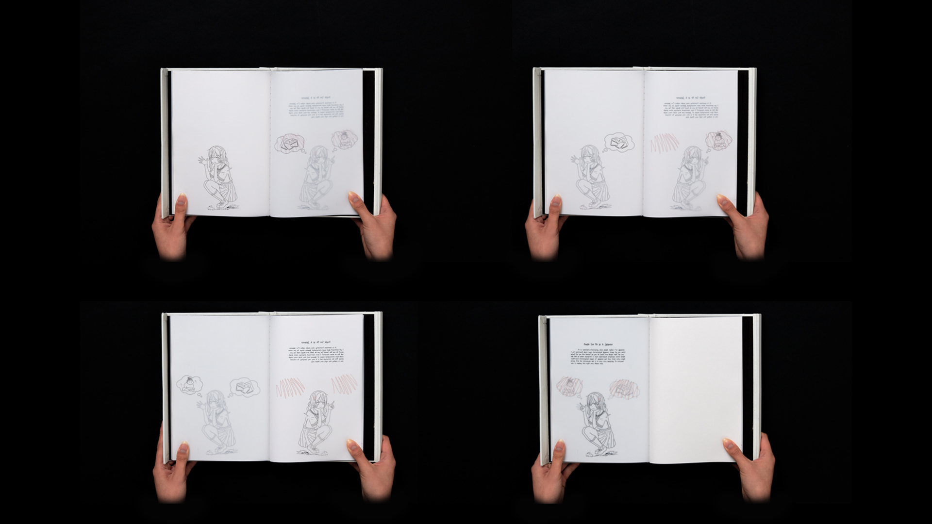
The design style is meant to be a diary. With handwriting and line drawings, I aimed to create a warmer and approachable vibe. This style was challenging as I am not a drawer. I wanted to do something challenging and different as this was my final project at university. I chose this binding style as a part of my challenge as well. I decided I want to have both Japanese which reads from right to left and English which reads left to right. Having two spines in one book and having a flap with magnets to stay contained. I used drafting paper for my paper stock. Transparency is great for my book, as I wanted the audiences to flick through the images to imagine the story first before they read. I also inserted blank pages in between my stories. It is for audiences to write their thoughts and relative stories. I wanted to have this book as a collaborative outcome in an exhibition situation.
The content of the book might not be a big deal to somebody, but a story is a story and if I can make an impact on even one person out of a hundred or a thousand, I would be happy.