


MY PRACTICE
As a visual storyteller and idea enthusiast, I have an undeniable affinity for illustration and commercial art. My passion lies in visual communication and its power to entice change, provoke emotions and unfold new understandings.
Creating new worlds with unique backstories and characters is my favourite part about what I do. Between the digital space and printed media, I have discovered that there is always a need for design which betters people’s lives. Whether it’s to inspire a team of office workers, campaign for an endangered species, or even to reassure diagnosed patients, my work is a testament to how versatile the language of illustration is.
In creating a wordless illustrated children’s book, I aim to encourage diversity in learning styles within children’s literature. My publication as an artefact endorses the importance of visual literacy and oral tradition whilst challenging the idea of uniform teaching tools.
My project may not communicate through words,
but it communicates with skin colour.
It communicates with ducks.
It communicates through the “gaps in between.”
PURPOSE
RARE is about subverting the cautionary western fairy tales that many of us grew up with. My publication replaces fear-driven morals with a courageous narrative and gives power to the modern reader’s unique interpretation.
Image-based narratives have a plethora of benefits for children of all ages. Some of these include developing self-expression and the ability to draw on personal experiences, as well as increasing sensitivity towards multiple perspectives and cultures.
AMBIGUITY
In the spirit of diversifying perspectives, I chose to be experimental in my approach to storytelling and considered all factors of intersectionality.
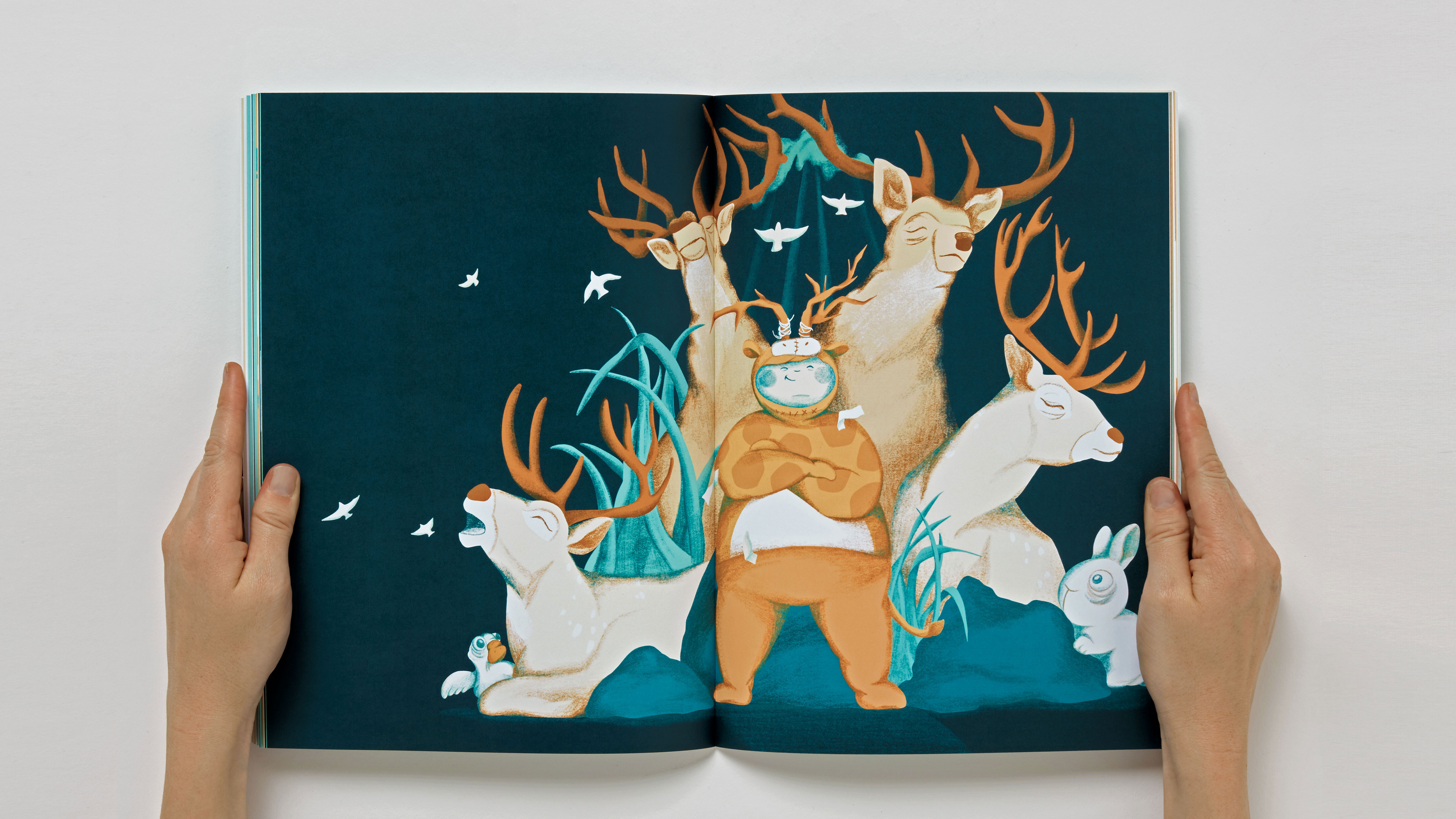
The world which I created has an air of ambiguity in regards to things like gender and race, leaving room for any child to step into the shoes of the protagonist.
Ambiguous character design can be spotted in aspects such as the chameleon-like skin colours of my human figures.
THEMES
My narrative depicts a protagonist that learns they do not have to conform to the status quo to find where they fit socially, encouraging a dialogue about identity and belonging. Themes surrounding self-image, social exclusion and companionship are also explored.
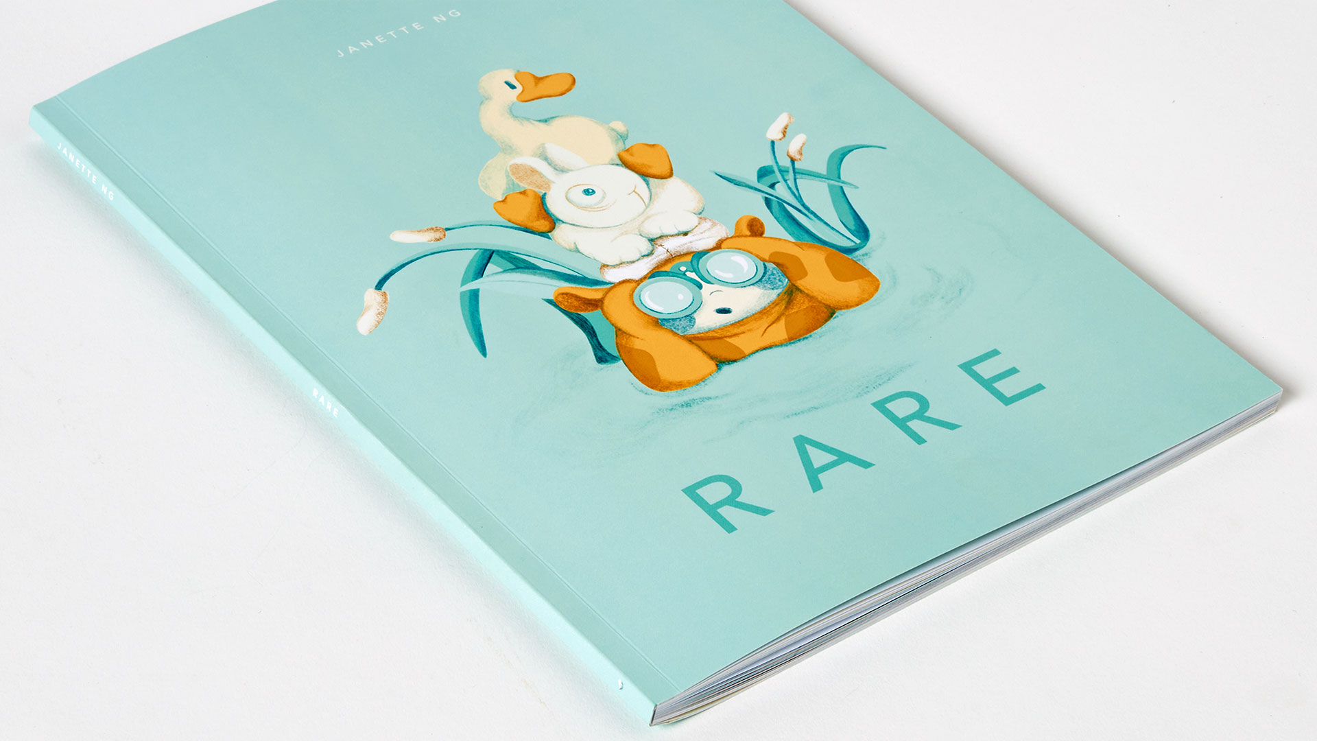
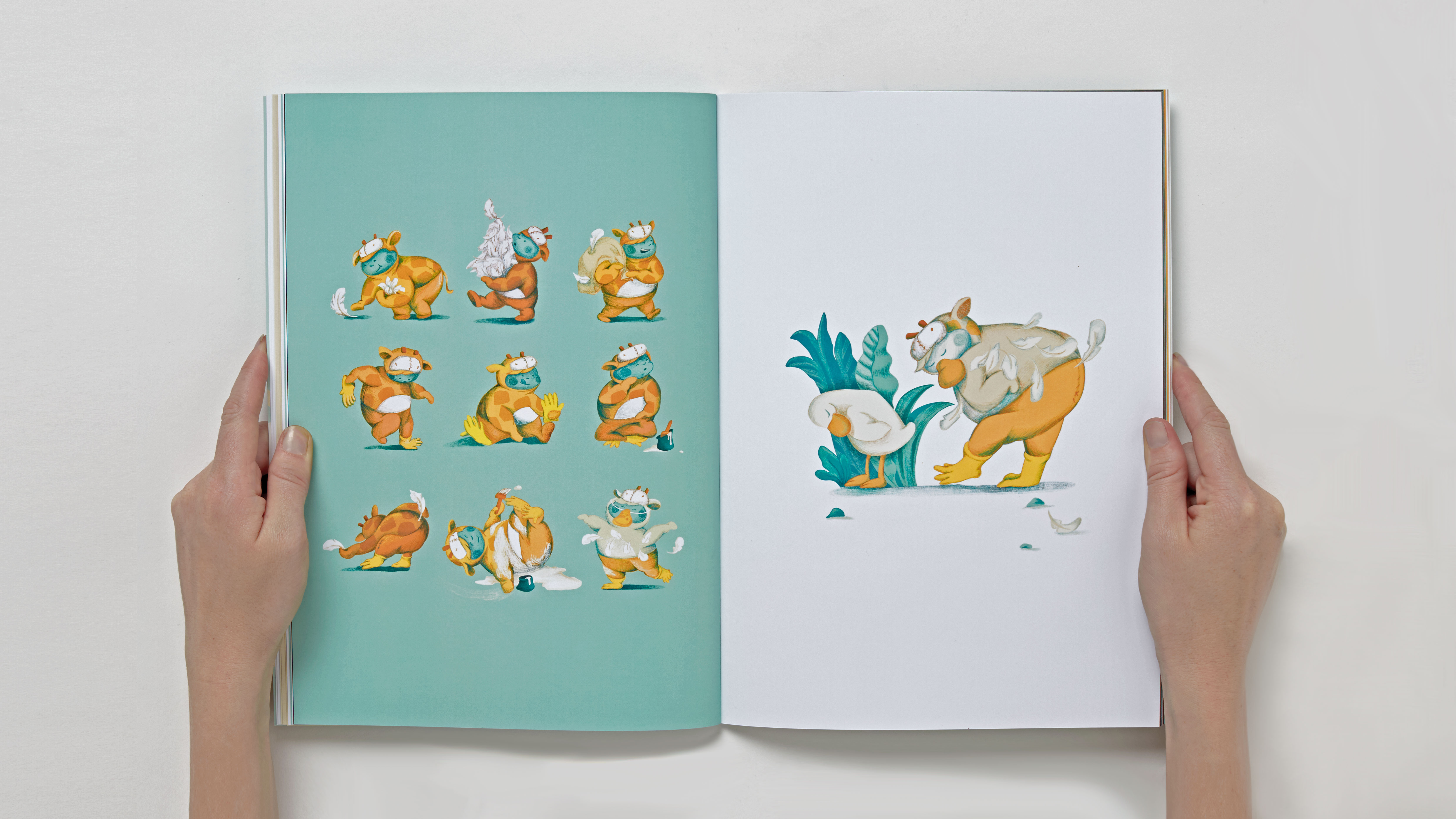
The story follows a young giraffe fanatic who is enthusiastic about their trip to a wildlife park. Just when it looks like their attempt to find a group of playmates falls flat, they discover a companion well worth the trouble!
SEMIOTICS
An array of visual clues has been left throughout the publication to help the reader along on the journey.
A few examples include the compass which is symbolic of finding your way, the ducks which represent flock mentality, and the fence which symbolises the divide between animal families or social groupings.
Small visual metaphors also solidify my themes such as signage, binoculars and maps - to name a few!
COLOURWAYS
I used a limited colour palette of two colours and white to help my readers focus on visually decoding the narrative. I developed a few other methods of encouraging prolonged engagement including utilising the full tonal spectrum of both colours for vibrancy.
I also used negative space to highlight or recede subjects and experimented with ambient occlusion.
GAPS-IN-BETWEEN
The nature of this text demands that the reader use much more closure whilst interpreting the story, in comparison to interpreting a traditional picture book. It is the gaps in-between each change of scene that the reader must fill in for themselves.
Because each interpretation is so unique, the emotional investment shown from those that read my book was exciting to witness (both the giggles and the heartbreak).