


Temporal Baskerville: a-variable-typeface
Temporal Baskerville is a variable typeface exploring the realm of temporal typography and illegibility. I situate my practice in typography and publication, exploring design history through changing technologies. My practice is explorative, the outcome developed through research and experimentation with significant typefaces. The publication produced is a journey through the typeface, a process book in itself that shares with the viewer the depth of the typographic exploration.


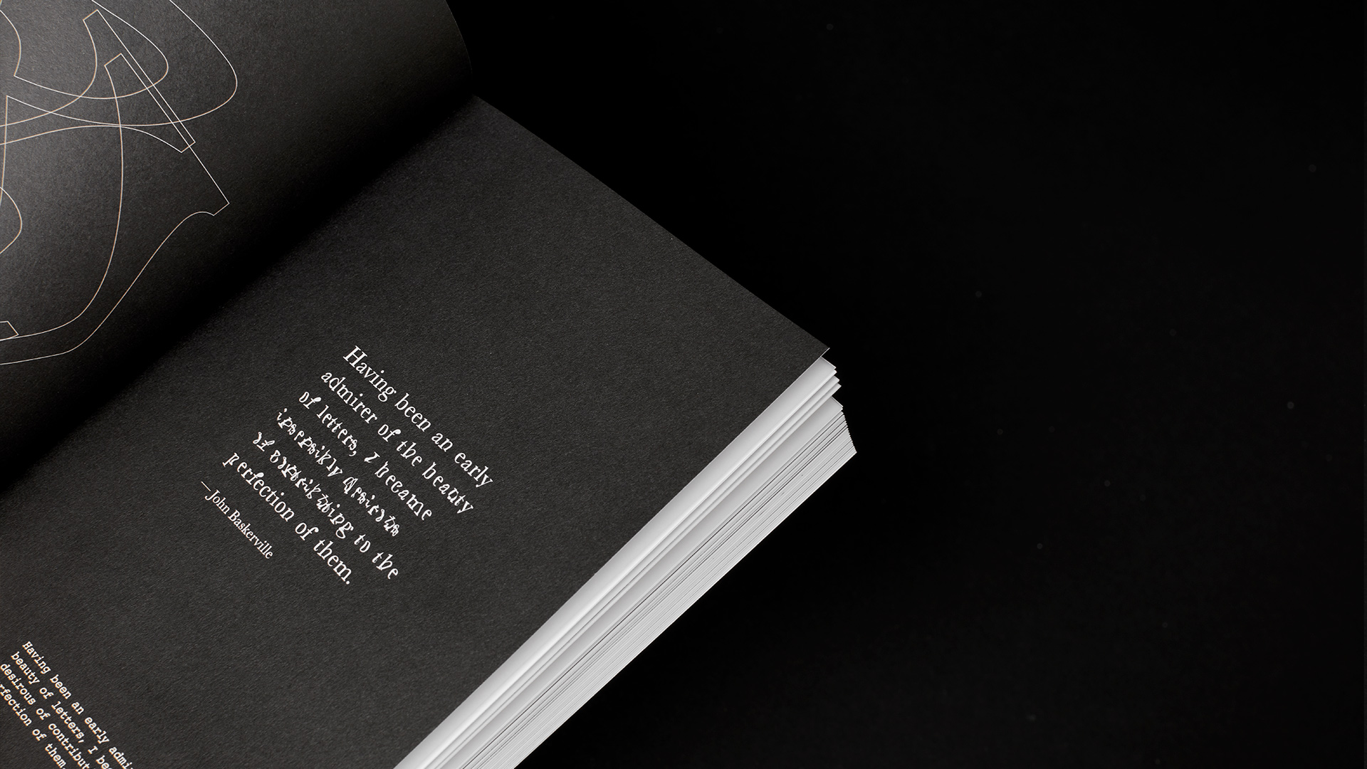
Temporal Baskerville is a variable typeface exploring the realm of temporal typography and illegibility through Baskerville – a significant typeface, known for its timeless legibility. When first introduced in 1757, Baskerville was criticised as being illegible, the contrasting thin strokes “fatiguing to the eye”. The qualities of Baskerville’s legible letterforms can still be identified in the variable typeface until the furthest along the variable warp axis.
Letterforms are ubiquitous. They are overlooked despite their role of composing every word we write and every sentence we write. Visual language is just as important as verbal language, allowing the reader to have sensibility and spirit before even reading it. The character and significance of the typeface is essential for the verbal language of a manuscript to be understood in full.
Typography usually sits in the realm of either kinetic or static type. When it escapes this, it becomes temporal typography and cannot be evaluated in the same way. Legibility is re-prioritized below the formal qualities that make up a letterform. This is a starting point to looking at perception and experiential conditions. This project sits directly in Typography as a convention of graphic design and responds to the changing typography landscape, yet typefaces like Baskerville have been timeless and used since the 1700’s. When first introduced in 1757, Baskerville was criticised as being illegible, the contrasting thin strokes “fatiguing to the eye”. Time periods have changed this, it is now known as one of the most legible typefaces because of the strokes.
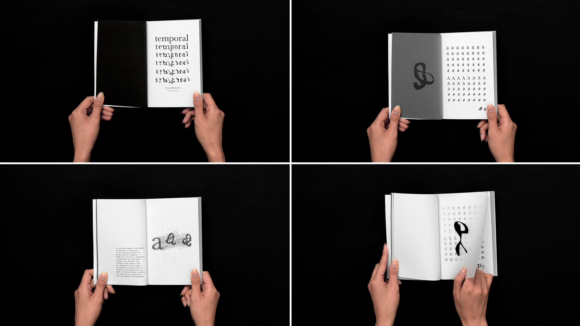
This idea of legibility is important for Temporal Typography. Legibility is the qualities of the letterform being recognizable but isn’t necessarily being seen as a letter. When dealing with fluidity, legibility is continually flowing. Legibility assumes the viewer of the type is trying to read. Readability on the other hand speaks about how well type can be read, the ease of reading a body of text. This can fluctuate depending on if a typeface is being read on paper or screen, characteristics that inform legibility are still important for readability. Perception and perspective of the viewer determines how the form is seen or read. Since Temporal Baskerville has transitory elements, the perspective and perception of these forms is also fluid and changes through the time on the page.
Temporal Baskerville is a typeface that is legible at most instances on the variable axis until the very end where it is hard to pick the forms. This illegibility creates a difficulty for readability, but the viewer can begin to guess and see forms from the other instances in order to make connections. It is not necessarily the most practical typeface in an everyday type setting environment but is a display typeface that explores depth in typography design. Letterforms are often overlooked by designers and non-designers who aren’t aware of typeface design and the detail that is involved.