


The VHS Cover Design
I’m Matthew W. Walker, a graphic designer and filmmaker based in Auckland. Across my three years at AUT, my passion for web design has shifted to focus on print design, branding and design for film. My practice is a fusion between graphic design and filmmaking. I consider design to be a way of problem-solving and filmmaking a way of expression. Above all, I'm a storyteller. I theme my practice often around nostalgia, in particular, my childhood. An especially fond memory of mine was experiencing animated films on our family VHS set, hence the idea to explore this theme.
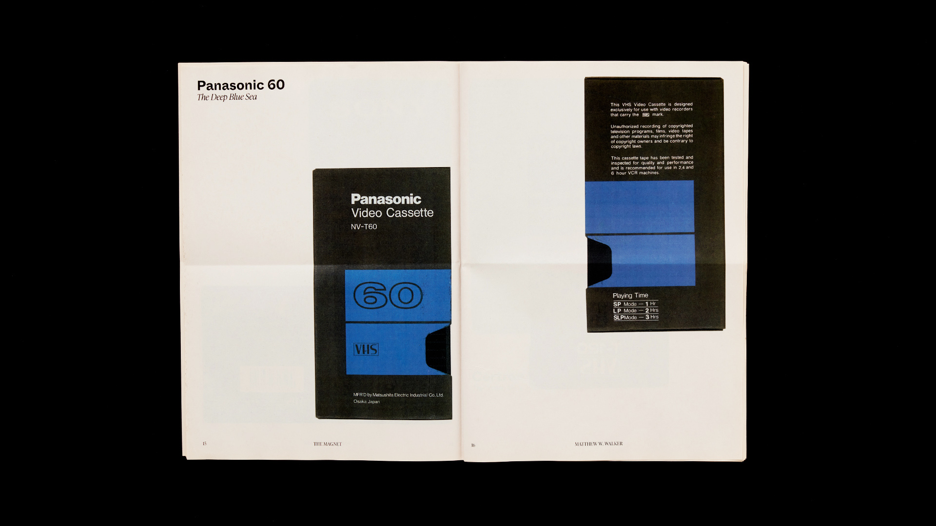
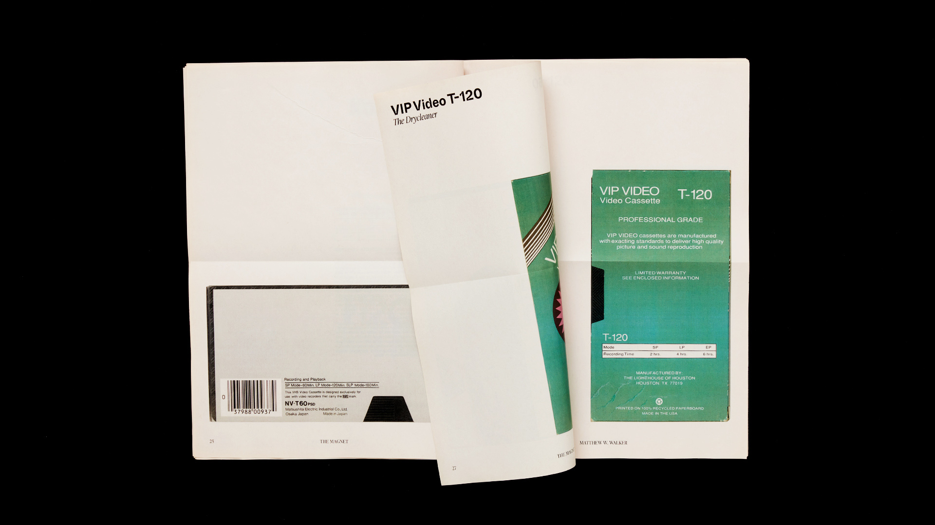
The Magnet, named after the magnetic tape, is a full-scale newsprint publication that archives iconic VHS tape cover designs produced between 1976 and 1996. The publication provides a look into the language of 20th century information design and graphic applications that have stood the test of time. Long live the VHS.

The Magnet was a project that engaged with a topic, issue or opportunity that was relevant to communication design. I focused on a single subject within design; the cover application of VHS tapes from multiple leading technology brands.
I’ve always had a passion for both graphic design and film and how the fields could be combined. My interest in the VHS came from looking through old tapes, cassettes and photographs from my previous home. I quickly fell in love with the minimal design language of the blank VHS tape covers.
Two key design elements of The Magnet were the masthead and paper stock. I chose to design on newsprint to give the publication the look of an old newspaper. I wanted to imply I was aware that this era of technology had passed its prime, but not without birthing some timeless applications of graphic design to support the product. Working with newsprint had also been a dream of mine since looking through food-based magazine Stone Soup. The cover masthead, typeset in Whyte Inktrap, complemented the paper stock quality and contained interesting rectangular crotches that resembled tapes.
The primary restriction of The Magnet was its editorial system. I limited myself to one cover design per spread, accompanied by one caption for each tape, letting the cover design speak volumes instead of adding larger text for the sake of balance. The visual index at the start of the publication replaced what would have been lengthy historic research. This visual language created a gallery effect, turning the tapes into treasured artefacts, which I felt increased their value as design objects.
I was aware that The Magnet would appeal to people aged between 40-60 considering the release of the VHS in 1976. I was equally aware that any public gallery of images would commonly be open to people of all ages, therefore I felt a responsibility to create a neutral display of artefacts that could appeal to designers, filmmakers, tech experts, VHS lovers and everyone in between.