


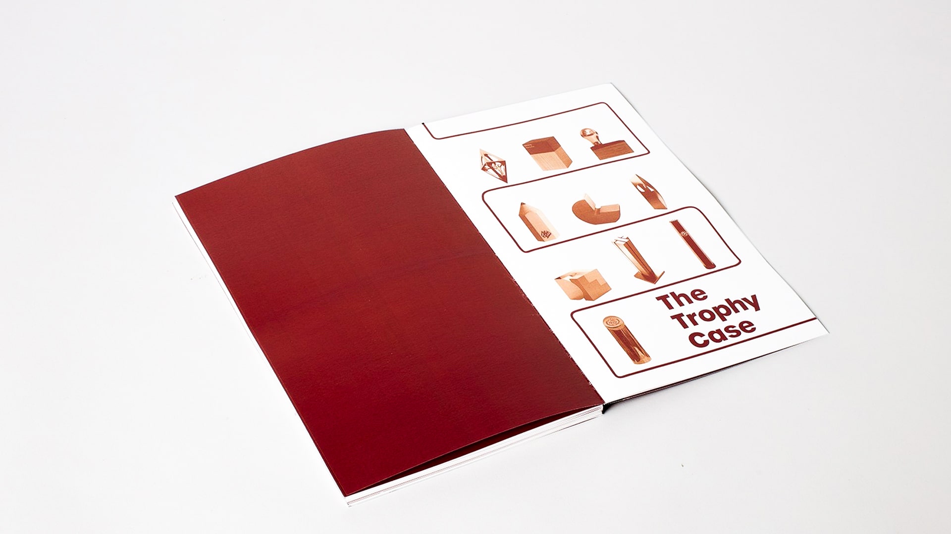
THE TROPHY CASE
I am a detail-oriented design student at Auckland University of Technology majoring in advertising, marketing and branding.
As a young designer, I enjoy creating branding, advertising and graphic design for businesses and clients. These incorporate skills in which I have developed over my three years at university. I would like to continue working in this field in my future career.
I am enthusiastic about learning and growth opportunities within my industry and strive on being able to meet these opportunities with an open mind and a positive outlook.

“The Trophy Case” explores and collates a range of information about international design awards in which creatives such as you and I enter into. Intended for the purpose of informing individuals interested in graphic design awards, it encourages creatives to enter these awards and earn the accolades they deserve for their hard work and effort.
The copious number of design awards in the industry initiated the first set of parameters of this project. Ideally, I would collate all the design awards available, creating one large directory of information. However, pre-existing deadlines limit the amount of time I had to spend on research and information gathering.
The information collated in the publication is intended to be used by graphic designers who are looking to learn more about the design awards offered in our industry. Saving their time, effort, and money on researching all the design awards out there, all the information they need in one convenient place.
My ignorance became a great learning opportunity. As a young designer stepping out into the industry, I was unaware of how many international design awards are available to us. Presenting me with an opportunity to learn and share my knowledge with other designers in the same position as I was.
I looked at what it meant to be a graphic designer and how they were recognised in the industry as the best of the best. It was through design awards and personally, I knew very little of these awards.
Through discussions with my fellow students, I began to realise they didn’t know much about design awards either. The collective ignorance of something so integral for our industry threw me and started to pave the direction of my final project.
I developed a metaphor within “The Trophy Case”, not only does it contain the ten most prestigious awards but plays with how people display their trophies. The design features respond to this metaphor through the colour choice, publication size, and casing.
My colour choice was a dark red tone as it has positive connotations to being classy and elite. Red eliminated any categorical preconceived ideas which gold and silver could represent. The sizing of my publication, tall and with a small width, imitates a trophy, becoming one itself. The casing I used was a clear Perspex sleeve to demonstrate the trophy being placed in a trophy cabinet.
“The Trophy Case” is situated as a reference work, designed to help guide and inform graphic designers in providing information on the most prestigious design awards open to the profession.