


History preserved through design
Tried & True is history preserved through design. A memoir to my family heritage, distilled in the form of a recipe collection. It is an embodiment of the Pickworth family approach to food that reflects the values of hospitality, generosity and gathering. The publication brings together family stories and imagery that are woven through the recipes. It is a testament to their lives and the preservation of history for the next generation.

As a brand identity designer, I began to question how a designer’s personal and professional identity influences practice. Often designers develop a signature style that can be attributed to their identity, including their history and experiences. It sparked my own inquiry into my personal heritage and what has been influential on myself as a designer, particularly my upbringing and family history.
As an acknowledgment of all these aspects contributing to my identity, I have paid homage through a designed recipe collection. An embodiment of my family's approach to food, capturing moments in time and representing family values. Tried & True sits in the space between a cookery resource and a historic archive. It intends to capture and preserve my family history in the form of a publication. The publication brings together recipes, photographs and stories into a distilled form that acts as a keepsake.
Gathering and organising content has been a large part of this project. The recipes have been pieced together from old typewritten family recipe books. An important part of differentiating Tried & True is the family stories that are intertwined within the recipes. It creates a sense of place and time when the recipes were written and the significance to my family.
Tried & True is formed around my mother’s family, the Pickworths. Her family grew up in rural Southland, where it is beautiful but rugged and remote. A lot of their produce came from the land and they made do with what they had. I wanted to capture this feeling of authenticity and nature through deep neutral shades and typography that evoked heritage tones.
The aim of my publication was for it to be more than just a recipe book by weaving a story through the pages as the publication develops. A story told through both words and pictures. Historic family photos add to the heritage feel and correspond to the recipes. A thread of time has been created through the publication that travels from past to present. Each recipe section represents a period of time, and the audience experiences the lives of generations growing up as Tried & True develops.
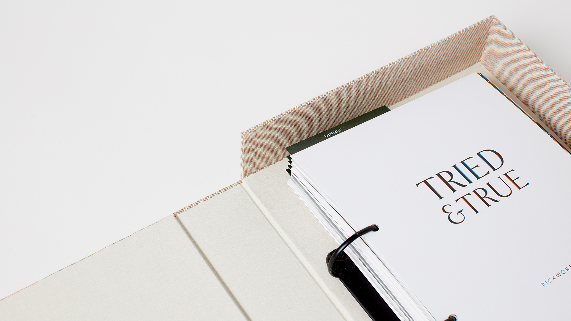
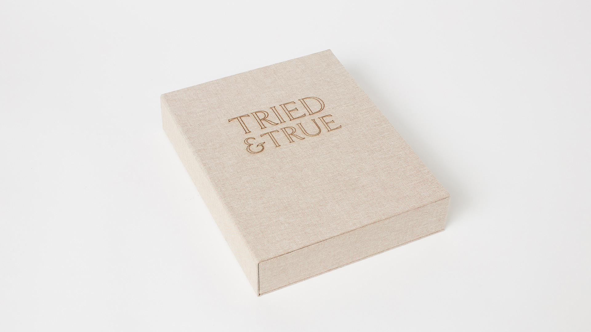
To capture a sense of the history that traverses from the old family recipe books to Tried & True I have recreated the ring binder. I worked in both the bindery and the laser cutting workshops to personally hand make the folder. It creates a space where recipes are fluid and can be added in or removed. The design is consistent with archiving and preserving history, the central theme of my publication. It will allow for growth as the recipes are passed down to future generations.