


Phillip Kim
Wai Horotiu Display
instagram.com/phillipkimcomdesigner
phillipkimcomdesigner@gmail.com
Ki Uta Ki Tai, He Taonga Te Wai.
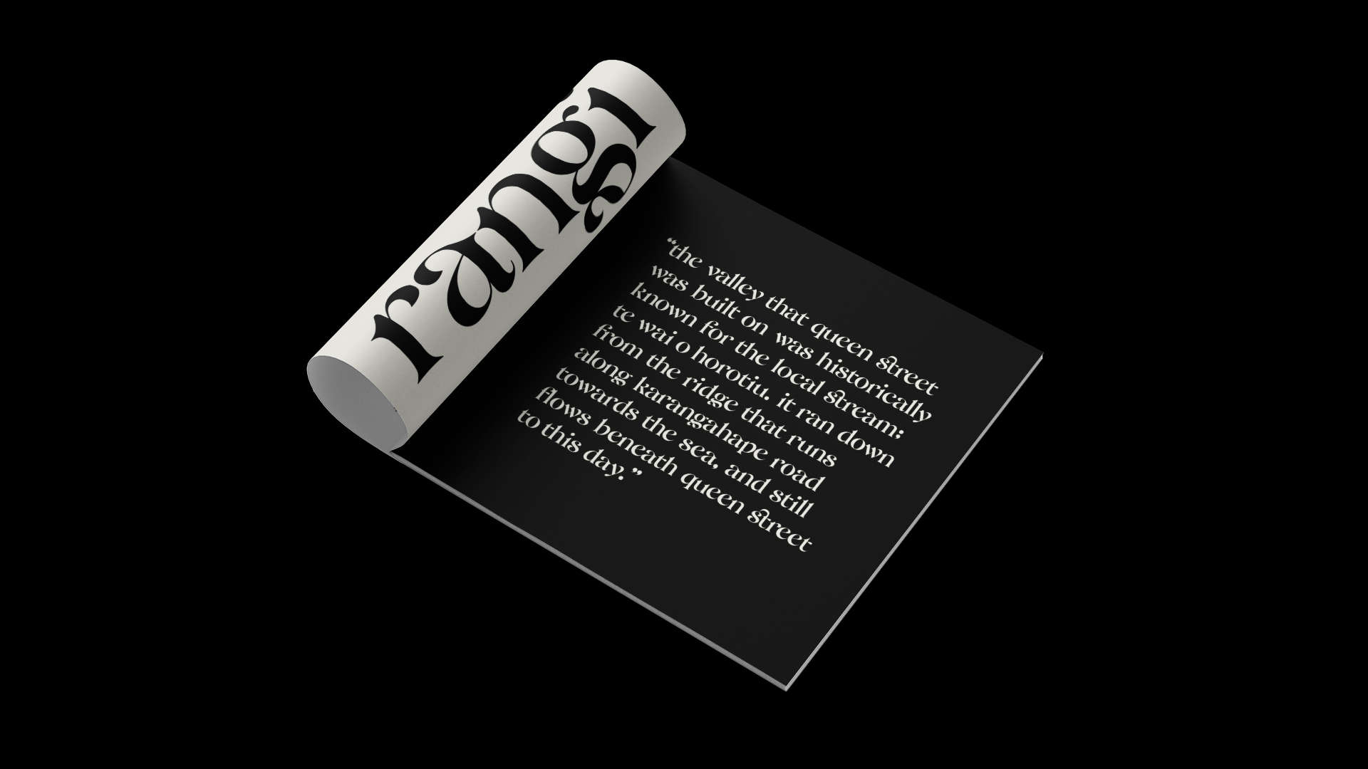
In this project, my intention was to design a typeface that celebrates the richness of the Māori culture and language. Wai Horotiu is a high-contrast serif typeface inspired by the way Te Wai Horotiu stream flows from Karangahape Road to the sea. The typeface captures the natural movement of the stream with its rhythmic flow that mimics the water's waves. The stylised wedge serif and wide contours were inspired by the decorative buildings on Queen Street. The high-contrast strokes and the masculine constructions were mined from the story of the legendary taniwha of Horotiu that was believed to have lived in the stream.
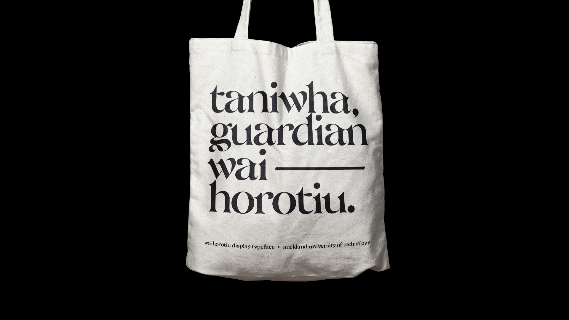

The core kaupapa of the project is 'communication' — in which ideas are translated and presented to a broader audience to better understand our world. This project was initiated by an idea of creating a typeface that typographically communicates Māori values and knowledge and promotes the richness of the culture. I wanted to amplify the connection that is valued in Māori traditions; the connection of tupuna, taniwha, kaitiaki, and the balance of tāngata with its surrounding whenua and moana. I began researching the spiritual world of Māori and their traditions. The results of this research have dictated both macro and micro details of the letterform design.
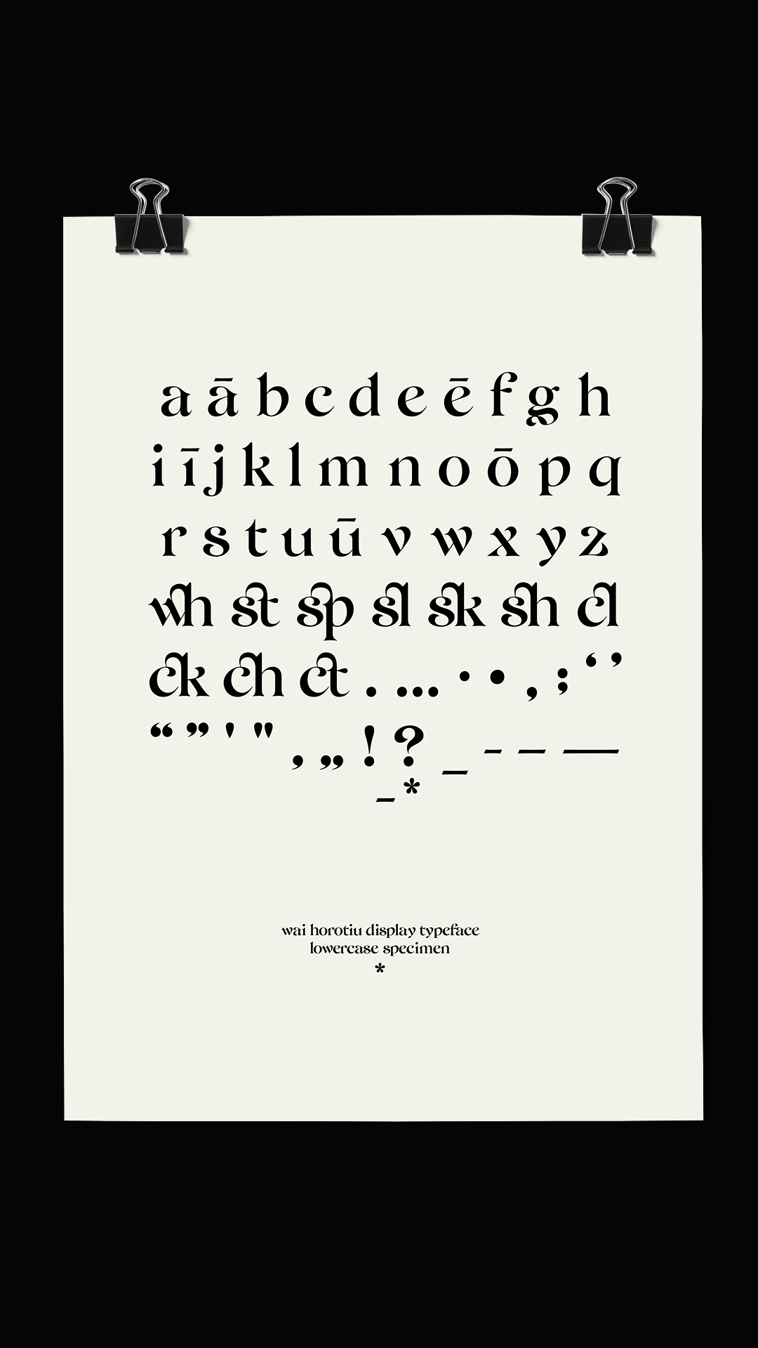
Creating a successful typeface involves looking at how designed letterforms work coherently as a group. Successfully executing this problematic task requires many trials and errors, and each letter has undergone countless modification to subjugate the rhythm and flow. The fundamental construction of the typeface is based on the abstract form of Wai Horotiu stream. The signature wave-flowing movement is produced by modifying the serifs and the arcs of each letterform. This concept underpins the fundamental idea of 'communication' and 'connection'.
Aside from the obvious inspiration of the waves of the stream itself, it also indicates the direction and the shape in which the stream flows. Wai Horotiu is one of many complex underground waterways that provides valuable drinking water to the Auckland CBD. Historically, these underground waterways helped settlements to flourish in Tāmaki Makaurau, and I wanted to capture these historical contexts and cultural significances with the movement of the stream indicated in each letterform. It was a difficult, yet fascinating project — I have learned and explored a range of practices and skills, and while this is not a complete set, it certainly is a stepping stone for my journey as a graphic designer.